352-804-2056
Big Picture
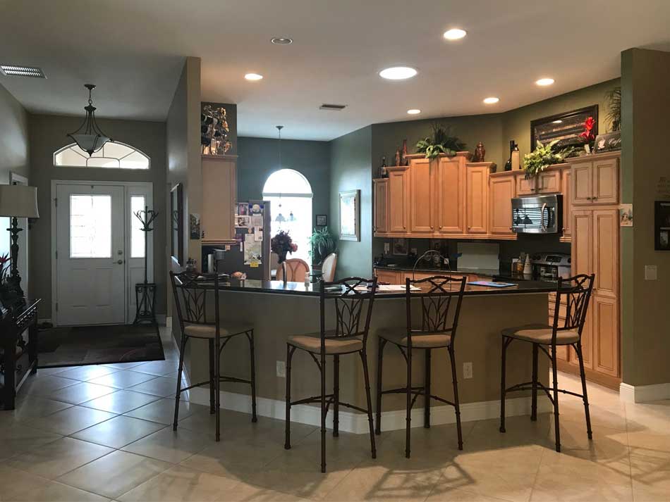
One of the most difficult things to do in design work is to keep your clients focused on the big picture. A cohesive look at the end of the job is the only thing that matters because the big picture is the visual bang for the buck that was spent. Once we understand the big picture, we can then pick out details. Webster’s dictionary defines a detail as, “a small and subordinate part.” So then, the key to understanding design is to know which subordinate part needs attention and which part does not. If you are every questioning what to tackle first in your home, ask yourself, what do I see the most? Usually, repainting is the first thing we do because the walls create the majority of square footage and therefore are seen the most. If your home is an open floor plan usually there will be lots of kitchen cabinets to be seen and therefore a good space to keep updated. Let’s take a peek into a kitchen of a Gardenia Model to see how looking at the big picture created laser focus on what should stay and what should go somewhere in the heart of The Villages.
• Big Picture approach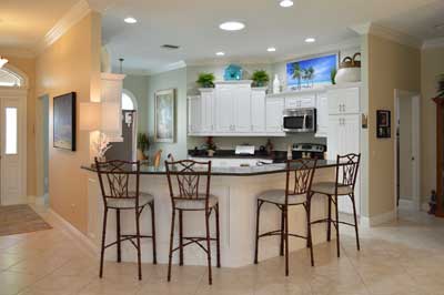
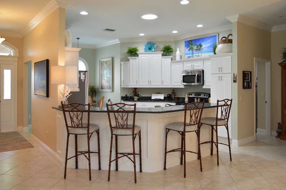
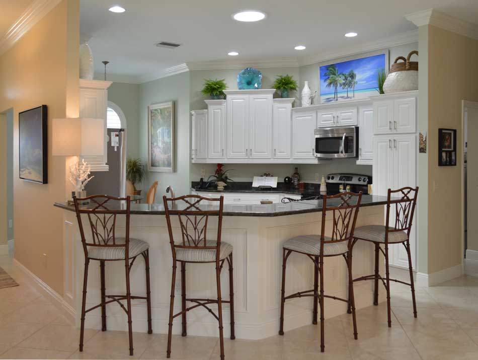
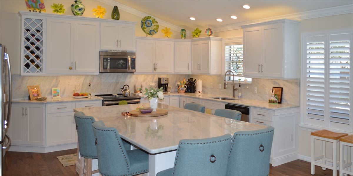
The homeowner was happy with her kitchen for a very long time but she decided that she wanted to lighten up. She thought that all the cabinets and granite would have to go but I thought we could keep the granite if we made a good paint choice and installed lots of white. The granite is a mixture of light and dark green that is really very pretty. The apple/sage green paint that was in the kitchen was sucking out light and playing up the darker green of the granite. If we changed the cabinets to white, added white wainscot to the island and change the paint color to a blue based green we could achieve a light bright look and save about six thousand dollars by keeping the granite.
• Repaint
Green is a great color to utilize in design but it can take light out of a space if you don’t pick a lively green. The green that we chose is Livable Green 6176 and has a bluish undertone that makes the green feel light and bright. This green is a great alternative to blue if you are someone who does not like blue.
• Kitchen cabinets
The entire kitchen was refaced in white! The original kitchen boxes stayed in place and the doors were removed. The boxes were then painted with a paint that sticks and won’t come off. New and larger doors are put up in place of the old doors. The new doors do not have a space between them and are taller than the old doors. When there is no gap between the kitchen doors, the cabinets look larger and more impressive. The white cabinetry made the lighter greens in the granite come to life and it looked fresh and new. Finally, the kitchen cabinets receive a larger crown molding at the top of the cabinetry.
• Wainscot
In any model with an island it always looks good with wainscot on the island. When the kitchen is white, the white wainscot adds another bright pop that really makes the island stand out and is very complementary to the granite. Also, the white wainscot adds visual continuity between the island and the cabinets and the spaces look connected. If the kitchen cabinets are dark, the white wainscot under the bar pops in contrast to the dark cabinetry and the contrast complements by adding light.
• Lighting
The homeowner changed all the lights to LED in natural light and it looks so much better. The other bulbs were yellowish and had to go!
• Shutter
The windows received shutters that went completely around the window. When you install the shutter over the entire window, the window stands out because the shutter has its own exterior molding so the window looks more finished.
• Large art and symmetry
I love to display large art over the cabinets in the Gardenia Model. The coastal picture titled, “Wish You Were Here” provides an eye catching pop above the cabinets. We placed a large wicker basket over the pantry and it filled the space well. For the descending cabinets we placed a blue glazed floral plate on the top cabinet and two identical ferns in teal pots to balance each side of the cabinetry.
• Reuse bar stools
We were able to re-cover the bar stool seats and add foam to make them more comfortable. The fabric on the stool matches the dining room table chairs.
P.S. –Attention all club presidents! We give free decorating seminars. It is lots of fun and very informative. Call and schedule your club today. Also, we are on-line check out our web-site at www.ruthdyer.com and you can always e-mail us at ruth@finishingtouchfl.com . Call Ruth your full service decorator at 352-804-2056.