 352-804-2056
Bespoke Design
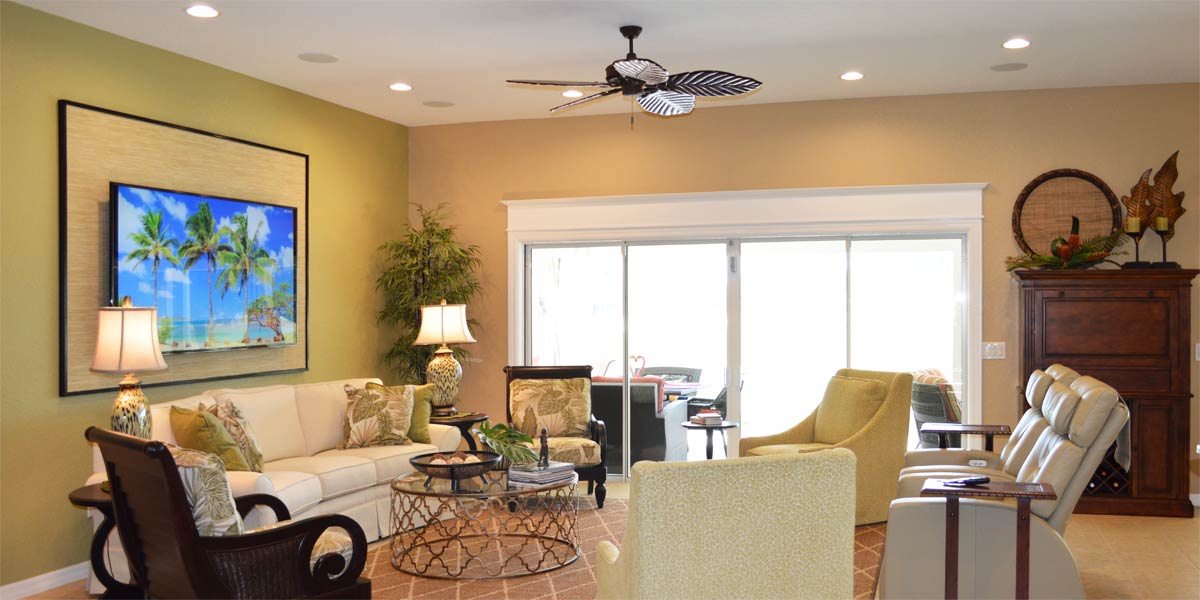
The word bespoke sounds lofty and out of reach. It brings to mind a scene of exclusive people sipping tea and speaking in quiet tones while gloved butlers serve them cucumber sandwiches. At least that is the picture that comes to my mind. But where did this often-overused word come from, and what does it really mean. Its origin is surprisingly humble and its meaning is clear. The term began in the tailoring world, when a bolt of fabric was spoken for and set aside to be made for one person. Over time it wandered into marketing language, where it is often used to suggest exclusivity rather than personalization. In home design, though, it still holds its original spirit. It describes choices made by the homeowner and a room that feels like it belongs to the person who lives there. When a homeowner selects pieces that reflect their taste, we can shape those choices into a bespoke look by leaning on the principles that make a room feel grounded and complete. Scale, balance, color, and considered placement work together to create a space that feels finished and unmistakably theirs. So, let’s peek into the living room of a Siesta model and see how bespoke design can elevate a home somewhere in the heart of The Villages.
• Paint
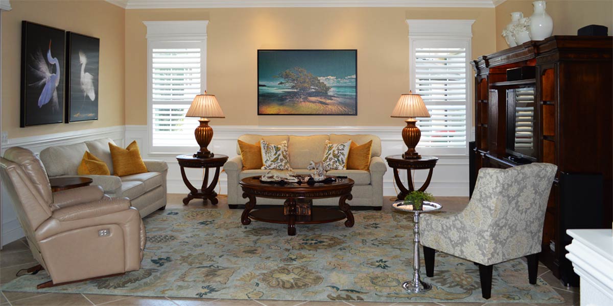
The homeowner had enjoyed the cheerful yellow on the walls for years, but she was ready for something calmer and more grounded. She wanted a color that felt rich and neutral, something that would settle the room rather than energize it. We hung large painted samples and stepped back to see how each shade behaved in the light. Repose Gray rose to the top. It is a soft grey-griege with undertones of violet, green, and blue, which give it warmth and depth. Those undertones keep the color from feeling cold, allowing it to work comfortably in the space. A quick reminder about sheen makes all the difference. Satin or eggshell finishes let the light move around the room, giving the walls a smooth, welcoming glow. Flat finishes tend to absorb light and leave the surface looking chalky, which can dull even the most beautiful color.
• Furniture Placement
We kept all of the original furniture, but the living room needed a new sense of flow. The sofa had been acting as a divider between the dining room and the living room, which made the space feel more closed off than it needed to be. By moving the sofa to the wall between the windows, the room immediately opened up. The sightlines cleared and the space felt more welcoming. There was plenty of room to place a chair on each side of the sofa, which created a natural invitation to come in and sit down. Each chair had its own pattern and separating them allowed those patterns to be appreciated rather than compete with each other. The room gained balance without feeling staged. In an open concept home, the goal is to let the spaces breathe. Traffic should move easily from one area to the next, and furniture should support that flow rather than interrupt it. Removing the visual barrier of the sofa allowed the living room and dining room to feel connected while still maintaining their own identities.
• New Rug
The living room needed a rug, but adding another pattern would have made the space feel busy. A neutral option was the best way to support the room without competing with the existing elements. The homeowner chose a natural jute rug, which brought in soft color and a warm, organic texture. It feels comfortable underfoot, holds up well with pets, and adds an easy, relaxed layer to the room. The six by nine size fits the space exactly as it should, grounding the furniture without overwhelming the room. By keeping the rug simple and neutral, the bold starfish pattern in the dining room was able to stand out and shine, giving each area its own moment to shine, while still feeling connected.
• New Window Treatments
The original window treatments were hung at eighty-four inches, which placed the top of the panels right at the top of the window. That height stopped the eye instead of lifting it, making the windows feel shorter and the room feel lower. The sheer fabric was also too light to make an impact, so the treatments blended into the background rather than adding anything to the space. We replaced them with ninety-six-inch-long bright white panels. The fabric has the look and feel of linen, and the lining gives each panel a smooth, graceful drape. They hang from grommets, which creates clean folds and a continuous line from top to bottom. By installing them at ninety-six inches, the panels rise all the way to the ceiling on the right-side wall. This simple change makes the room look taller, and the crisp white color stays neutral while still bringing a fresh, noticeable presence to the space.
• Re-hang the Artwork
We kept all the homeowner’s artwork, but giving each piece a new place brought fresh energy into the rooms. The large mirror was moved to the wall above the buffet in the dining room so it could catch the light from the slider and reflect it back into the space. That single change brightened the entire room. In the living room, we hung a large colorful piece over the chair and another over the sofa. With the new bright white window treatments framing each wall, the white matting on both pieces stood out in a clean, intentional way. The artwork felt connected without matching, and the room gained a sense of unity that had been missing before.
• TV Focal Point
We added a floating shelf above the TV and placed a large clock above it, which immediately strengthened the entire wall. The color of the shelf tied in with the TV stand, so once it was installed it felt like a natural extension of the existing furniture rather than a new element competing for attention. Lifting the eye upward created a taller, more balanced focal point and gave the TV wall the presence it had been missing. The clock added scale and interest, and the whole arrangement now feels visually anchored.
• New Light Fixture
The homeowner chose a new light fixture for the living room, and it transformed the space instantly. The fixture is a woven sphere in the same warm tone as the jute rug, which ties the room together without calling attention to itself. Its open design creates a clear statement while still allowing the eye to travel through it, so it adds presence without blocking the view.
Call Ruth your full service decorator at: 352-804-2056
or Contact Us
Before Image Below
