 352-804-2056
Hues of Gold and Light
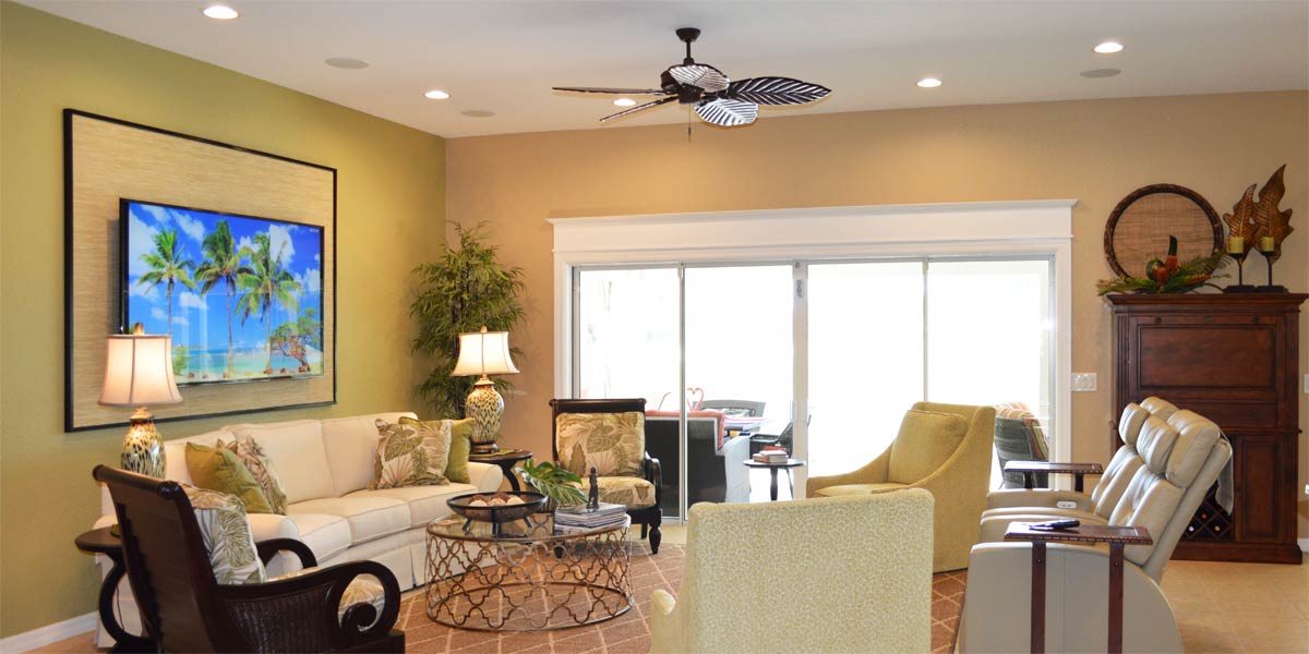
Orange heat glows in the western sky as golden rays burst through round cloud puffs scattered along the horizon. Everything the light touches is bathed in amber hues, stretching as far as the eye can see. I’ve never quite understood the saying, “Every cloud has a silver lining,” because the only linings I ever seem to notice are golden. Having lived in the Sunshine State all my life, I suppose I see the world through a golden lens. Gold and golden yellow aren’t just metals or finishes, they are accents that bring warmth, optimism, and a touch of radiance to a space. So, when a customer recently requested gold and yellow tones to complement varying shades of grey, I was happy to help. It’s a palette that I don’t get to work with often, but it feels grounded, luminous and inviting. Let’s peek into the main area of an Iris model to see how these colors come together, layered with a healthy dose of white, to create a fresh dynamic finish somewhere in the heart of The Villages.
• The back of the house
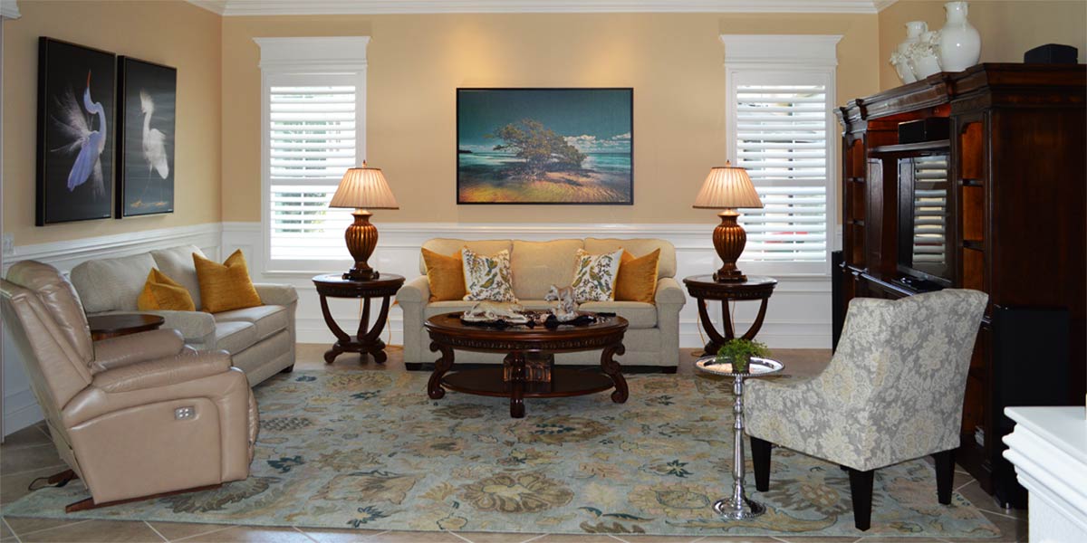
In the Iris model, the back of the house is the star of the show. A wall of expansive windows stretches across the rear elevation, framing a breathtaking lake view that deserves to be celebrated. To elevate this architectural feature and ensure the windows look finished, we added substantial casement molding with headers.Each window is flanked by four-inch casement molding, while the tops are crowned with matching trim and a bold twelve-inch header. The effect is striking: the windows transform into oversized white picture frames, drawing the eye outward and spotlighting the natural beauty beyond. The molding is painted in Extra White SW 7006, a crisp, luminous hue that stays bright against the flood of natural light. To maintain visual harmony, the door trim also needed to be bright white. Without it, the intense light pouring through the windows would cast shadows that make adjacent walls appear dull or muddy.
• Privacy treatment
The small window on the angled wall and the window for the dining room received a shutter for privacy and light control during the day. The shutters come installed with their own trim work and all you have to do is add a header to the top of the window. The trim on the shutters does not have to match the casement molding on the large sliders. That is impossible because the trim is a part of the shutter. When everything is white the difference in trims is not noticed because the eye just sees the visual cohesion of the white trim popping.
• Slider privacy treatment
Though the original vertical was only a year old, we replaced it with the Hunter Douglas Verti-glide. This product opens from the center and stacks neatly against the white molding on either side. The privacy fabric is a soft honeycomb material that gently filters daylight while providing complete privacy at night. When the blind is open, the Verti-glide blends into the surrounding white molding and becomes nearly invisible. It’s a subtle, elegant solution that enhances the view without distraction. It’s worth noting that even newer privacy treatments can be reconsidered if they limit the design potential. The style and structure of your window treatment will influence what type of molding can be installed, so choosing the right one is key to achieving a cohesive finish.
• Seven-inch crown
The homeowner chose seven-inch crown molding for the main living areas, adding a refined finish to the space. The crisp white stands out beautifully against the brown, grey wall color, creating a clean contrast that feels classic and fresh. The crown molding and window headers work in harmony, drawing the eye upward and framing the room with subtle elegance. The bright white trim enhances the architectural lines and helps balance the natural light, making the entire space feel more expansive.
• Board and Batten wall
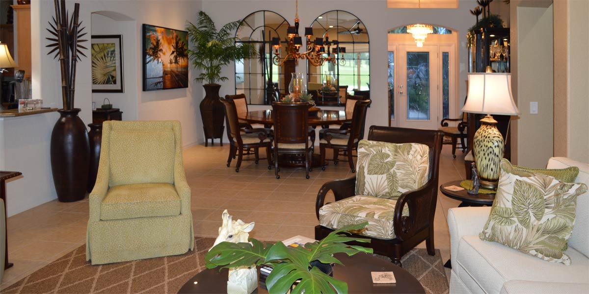
The Iris model shares a familiar layout with the Lantana and the larger Ivy model, each featuring a generous wall that connects the dining and living areas. This expansive surface offers the perfect canvas for architectural detail, and many homeowners have been embracing board and batten to elevate the space. The application involves creating a series of evenly spaced boxes across the wall, followed by a coat of white paint that unifies the design. The result is a striking focal point that adds texture and depth without overwhelming the room. Board and batten is a timeless choice, offering a sense of structure and charm that complements both traditional and modern interiors. It’s a detail that quietly anchors the space while allowing the rest of the room to shine.
• Paint
The homeowners chose the wall color in the design center, and it is a brown grey. The house has a lot of natural light, so the walls don’t look too dark. I like the high contrast between the brown grey and the extra white trim work. The look is fresh, crisp and modern.
• Gold and yellow as accents
The brown/grey and white palette in the home creates a striking high-low contrast, offering both depth and brightness. To bring warmth and a touch of color, we introduced gold accents throughout the space. Two large photographs capture the golden light of the sun, anchoring the room with a sense of natural radiance. A brass pineapple lamp adds a playful nod to the gold theme, while in the dining room, a yellow gold table runner sits beneath a bread bowl filled with lemons, adding texture and cheer. On the kitchen counter, three large apothecary jars were filled with lemons and a few limes for a fresh, layered look. Yellow tulips complete the scene, softening the composition and tying the palette together for a cohesive look.
Call Ruth your full service decorator at: 352-804-2056
or Contact Us
Before and After Pics Below


