 352-804-2056
Color Inspiration

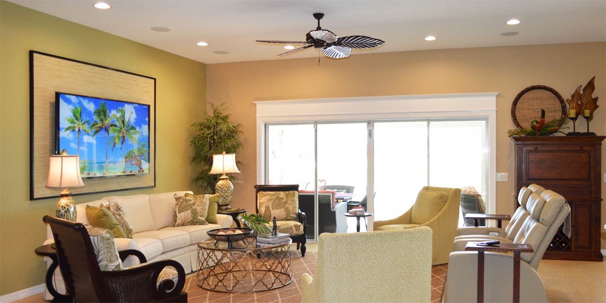
When moving from a home with delineated spaces, an open floor plan can be a real challenge. Many homeowners have a plan in their mind of how it could work but in reality it falls short of looking finished. Each room serves a separate and distinct function but with no walls to divide the space, everything has to share a visual connection. Rhythm is the design principle we lean on to solve the puzzle of making it all work. In design, rhythm is the placement of an accent color throughout the space that helps the eye move around the room and creates a visual connection.
When moving from a home with delineated spaces, an open floor plan can be a real challenge. Many homeowners have a plan in their mind of how it could work but in reality it falls short of looking finished. Each room serves a separate and distinct function but with no walls to divide the space, everything has to share a visual connection. Rhythm is the design principle we lean on to solve the puzzle of making it all work. In design, rhythm is the placement of an accent color throughout the space that helps the eye move around the room and creates a visual connection. Last week we visited a Begonia living room newly transformed into a visually cohesive space. This week we will see how the color influence of this Begonia started with one dining room wall somewhere in the heart of The Villages.
• Accent wall
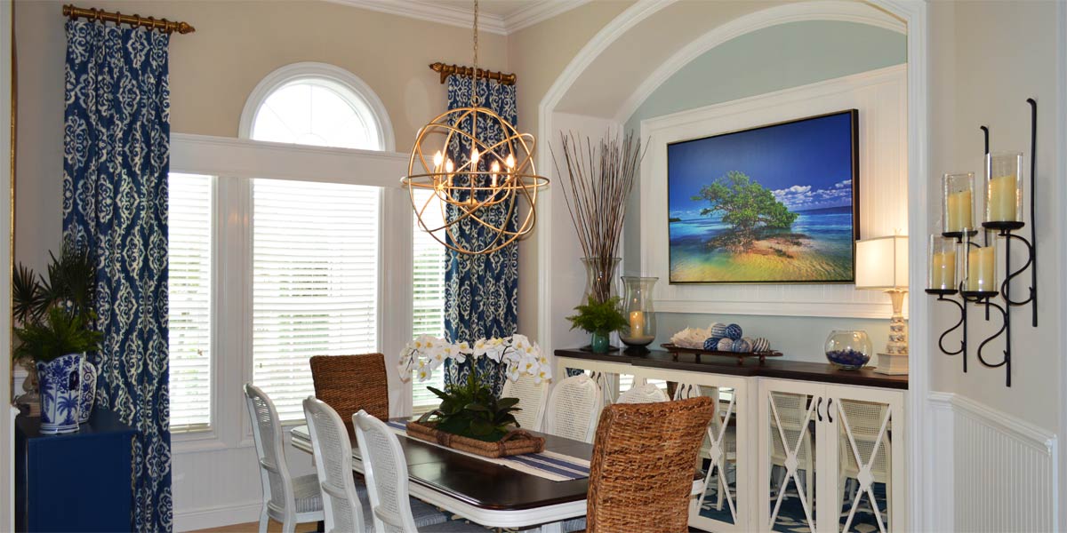
This large wall in the dining room had been painted a lovely shade of coral and though I do not usually advocate for accent walls, it did look nice as an accent. Also, a presiding factor in this case was that the kitchen and kitchenette were painted the same coral color. The coral color complemented the grey so well we needed to make this color make sense in the space.
• Rhythm
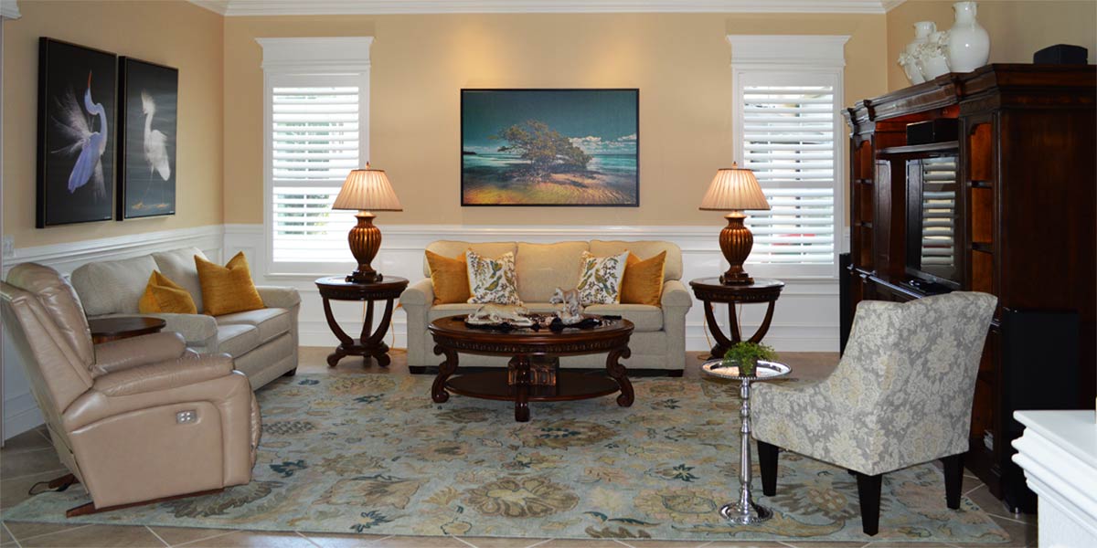
The concept of rhythm is one of dispersing color throughout the space at visual intervals or beats. In other words, we had coral in the dining room and last week, you saw us disperse the color coral into the all grey living room.
Now both rooms have coral and gray creating the visual connection.
• Furniture placement first
The dining room had too many pieces of furniture along the large wall. Between the china hutch, desk, and tree it was difficult to see the function of the space. The large wall is the natural focal point and the focal point needs strong visual definition.
We moved the desk and left just the china hutch on the wall.
• Display
A common issue with china hutches is how to use them for display. Often dishes are stacked and there a so many glasses they could not possible ever be used. China hutches are for display which is by definition the prominent exhibition of things in a place where they can be easily seen. Therefore, china hutches should always look their best. We did that adding teal plates along the back plate groove. The color teal in the cabinet will now pop against the coral wall in the same way the teal lamps and sunset pop against the gray walls of the living room. Also, the teal plates will help to show the other pieces in the cabinet for display. This is an inexpensive way to give the china hutch a boost. We added twelve plates.
• Art
We needed to add more color and we needed to break up the large wall just a bit more. We added two very large birds by Gene Rizzo, one great blue heron and one Egret. The focal wall looks great with larger items and less of them. The addition of teal to the space with so much coral is part of the rhythm that ties it all together.
• Rug
In the living room that had no coral, we added a large coral rug. Conversely, in the room that had only coral we added a large amount of gray blue teal. We did this in the form of a rug. This rug had all the colors of the spaces but the base color of the rug was gray blue teal. The rug tied all the art, colors of the wall and china hutch together in great big visual bow!
• Mirror
This model is a Begonia so it has no window in the kitchen. We used the arch mirrors to add the window back into the space. We hung an arch mirror on the back wall of the dining room, and we hung an arch mirror on the back wall of the eat in kitchen. They reflect off of each other in the same way a single mirror would catch light from the kitchen window of the Gardenia. They add back in the light that is missed by not having that precious window.
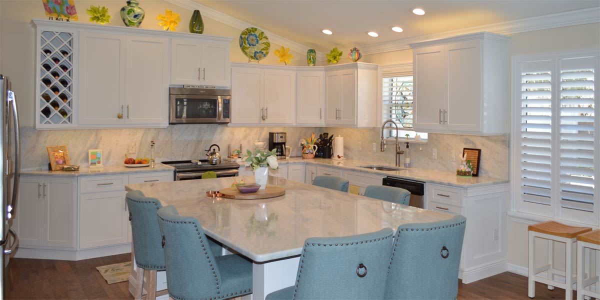
• The eat in kitchen
The kitchen was painted in the same coral color. Since there is no window the eating nook looked very dark. We added white wainscot to the bottom half of the wall. This addition of wainscot made the coral pop! We then added the mirror for more light. Gene Rizzo’s Sanibel lighthouse looks amazing against the coral wall.
P.S. –Attention, club presidents! I give free decorating programs! It is lots of fun and very informative. Call and schedule your club today or call Ruth your full service decorator at 352-804-2056
P.P.S Be sure to visit our home decor store, “The Finishing Touch” for your home good needs.
{gallery}Color_Inspiration:::0{/gallery}Click on Image to Enlarge ↑
Click Here for Full Gallery of Our Interior Home Decorating Projects
 Previous Post