Frequent visits to my Grandmother’s house occurred during the summer months when we were free from the shackles of school. Her house was the quintessential “Cracker” model set back in a field on the side of highway 54, surrounded by orange groves in Zephyrhills Florida. We would run through the groves collecting navels and tangerines and reconvene on the sprawling front porch to eat our citrus treasures, while daring one another to try a sour kumquat off the tree in the front yard. Growing up in the sunshine state means you will be conditioned to love the color orange and the color pink. If you are a new inductee to the Florida way of life you may embrace both or one of the colors yourself. Let’s take a peek into a Lantana in which the homeowners chose to pop orange as their Florida color somewhere in the heart of The Villages.
• One star of the show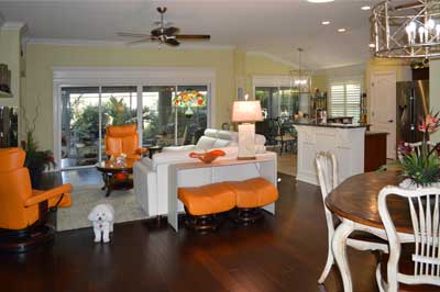
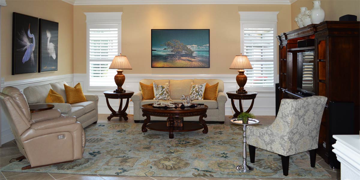
When I first looked at the space, the new furniture had just arrived. I loved the crisp look of the new sectional and the sofa table behind the couch, which is bent glass, looks amazing. The recliners had been a part of the living room and the homeowner had replaced the old sofa with a new white sofa and removed one floral print chair from the living room. Also, the new rug was a less busy palette. By removing all the competing prints in the space the orange chairs are the bright pop of color. The tiffany lamp shade shows much better with less competition in the space as well. When a space is filled with too much pattern, there will be visual competition. With all the competition gone the orange color is now the star of the show.
• Stuck
After the living room looked pulled together the homeowner wanted to know what else she could do to un-busy her home. Also, she wanted the space to feel more light, bright and airy!
• Trim out windows
In a Lantana the widows are one of the most important things to address. They are the first thing people see when walking into the home. Privacy was not an issue in this home, so we removed all the verticals and added casement molding and headers to the sliding glass doors. We put shutters on the kitchenette windows and added headers to them as well. In a Lantana it is critical that all the window and sliders look visually cohesive. The common visual bond between the windows is the headers; they visually link the two different types of windows together. All the headers fall at a similar height and the eye finds that very pleasing.
• Trick the eye
Once the windows are finished they will look larger and brighter. They look large because the header draws your eye upward; they look brighter because the white trim creates a bright picture frame to look out at the world. The light coming toward your eye is as bright as the trim; therefore your eye does not darken the foreground. The end result of white trim around windows is brightness in the home.
• Wainscot the island
The bottom of the island was painted in a shade of green that conflicted with the black quartz in the kitchen. Often times, customers want to paint the island base in a color to highlight the island walls but that draws the eye down in the space and usually, is too bright and visually competitive. We decided to wainscot the island in bead board with large trim boxes and then paint the entire thing white. The white looks so bright and amazing with the dark quartz. Also, the white shows off the corbels that support the quarts around the island. From the front door perspective the island is visually cohesive with the all the trim around the windows.
• Chandeliers
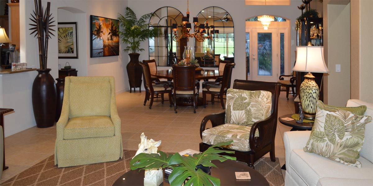
The first visit to the house there were three pendant lights hanging down over the island and in the line of sight, as well as two chandeliers of simple brushed silver. We removed the pendants above the island and had LED lights installed with dimmers. Then we replace the kitchenette light, Dining room light, and foyer light with golden bamboo. The dining room light is a round and open bamboo chandelier. The kitchenette and foyer light are the rectangular bamboo lights that complement the dining room chandelier. The new lights are very open and feel light in the space. They make a great visual impact without stealing the show. With all the pendants gone over the island the line of sight through the home looks clear and uncluttered.
P.S. –Attention, club presidents! I give free decorating programs! It is lots of fun and very informative. Call and schedule your club today or call Ruth your full service decorator at 352-804-2056.
Before and After Pics Below
