352-804-2056



More Is More
More is more and less is a bore is a saying that I love. Many people believe that less is more but is it really? Rooms with very little furniture often feel unfinished, and tile floors without a rug can look cold and empty. When people hear the phrase, more is more, they may picture clutter or small items that collect dust, but the idea can be interpreted in a much grander way. It can apply to any space, no matter the size. So, what if, we thought of the phrase more is more as larger and less. Choosing larger pieces and fewer of them creates stronger visual impact and makes a room feel abundant and inviting. This approach works in any room and gives the space a more complete and welcoming look.
Let’s take a peek into the living room and dining room of an Orchid model to see how larger and less can transform a space somewhere in the heart of The Villages.
• Large Windows and Less Walls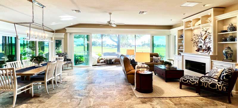
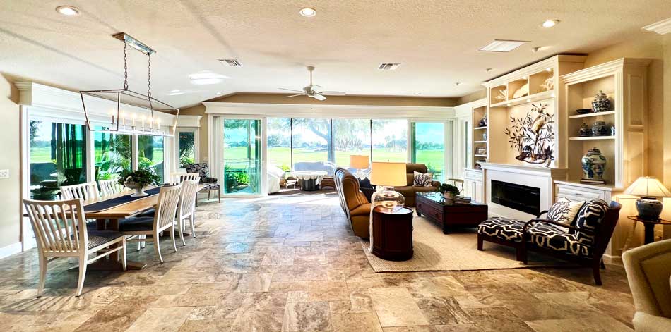
The homeowners love to entertain and wanted a larger space with more light for hosting guests. They chose to enclose the back lanai and raise the roof, extending the entire house to the edge of the original lanai. All of the interior walls were removed, and the ceiling was lifted to make room for a taller and more dramatic sliding glass door. The added height opens the view so completely that the outdoors feels like part of the room. On the left side, the windows that once belonged to the original kitchenette were opened up and replaced with another set of sliding glass doors. The result is a room surrounded by glass and filled with natural light, a space that feels expansive, welcoming, and perfectly suited for gatherings.
• Casement Molding
The large sliding glass doors were finished with substantial casement molding on the sides and headers at the top. Each opening becomes a wide picture frame that showcases the golf course beyond. By giving all of the windows along the back of the house the same treatment, the entire elevation reads as one cohesive composition. The windows look complete and there is no need for additional decoration.
• One Flooring
The homeowners selected travertine for the entire space from the front door to the back slider. It was installed without grout, and the result is beautiful. Even though the tile is amazing, tile flooring can feel cold without the softness and warmth that textiles bring to a room. The living area is defined with a large rug that absorbs sound and adds comfort underfoot when relaxing. There is also a second rug in the former living room, which now serves as a sitting room. In a fully tiled home, having two rugs in the main living space whenever possible makes a noticeable difference in how the space feels. There is an opportunity to place a rug under the dining table, but that choice depends on how the room is used. The homeowners decided against it because they felt it would make pulling out the chairs more difficult.
• One Dining Space
The homeowners entertain often, so a large dining table was essential. They no longer needed two separate eating areas as the original layout suggested. One generous dining space suited their lifestyle perfectly. It is a great example of larger and less, where one substantial piece creates presence, function, and balance without crowding the room. For those who are not expanding the house you could create a large dining space by enclosing the lanai.
• Large Open Chandelier
The homeowners chose a large chandelier to anchor the dining table, and it was an excellent decision. The open design of the fixture creates a strong statement without blocking the view beyond. When the landscape is the star of the room, it is important to keep sightlines clear and avoid placing anything that competes with the scenery.
• Large Media Unit
The homeowners installed a custom media and fireplace unit that serves as the centerpiece of the room. Its creamy white finish keeps the piece feeling light even though it is substantial in size. The design allows for multiple uses. The large fireplace adds warmth and ambiance, and the seating area is a comfortable place for conversation and for enjoying the art displayed above the firebox. When the homeowners want to watch television, a press of a button lifts a screen from behind the fireplace, temporarily covering the artwork in the center. The side towers were created to showcase the homeowner’s collection of blue and white ginger jars along with their impressive coral pieces. The display feels focused and beautifully contained, allowing each item to be appreciated. The entire wall unit is a strong example of larger and less. One well-designed piece fills the wall with purpose and presence, eliminating the need for smaller furniture or scattered accessories.
• Furniture Placement
The furniture is arranged with the sofa directly across from the wall unit, creating a strong focal point. A matching loveseat sits beside the sofa, forming an L shape that works like a faux sectional. The homeowners placed the loveseat toward the back of the room which keeps the space open and welcoming. A single chair is angled inward toward the sofa to complete the seating area. This layout works beautifully in models like the Lantana or Iris as well, because it keeps the living room open from the front door and encourages people to step in and relax. Turning the love seat toward the view would divide the room and make the entrance feel blocked. With this arrangement, the view remains visible the moment you walk in, and the seating area feels connected, comfortable, and inviting.
Call Ruth your full service decorator at: 352-804-2056
or Contact Us
After Image Below