 352-804-2056
Bespoke Interiors
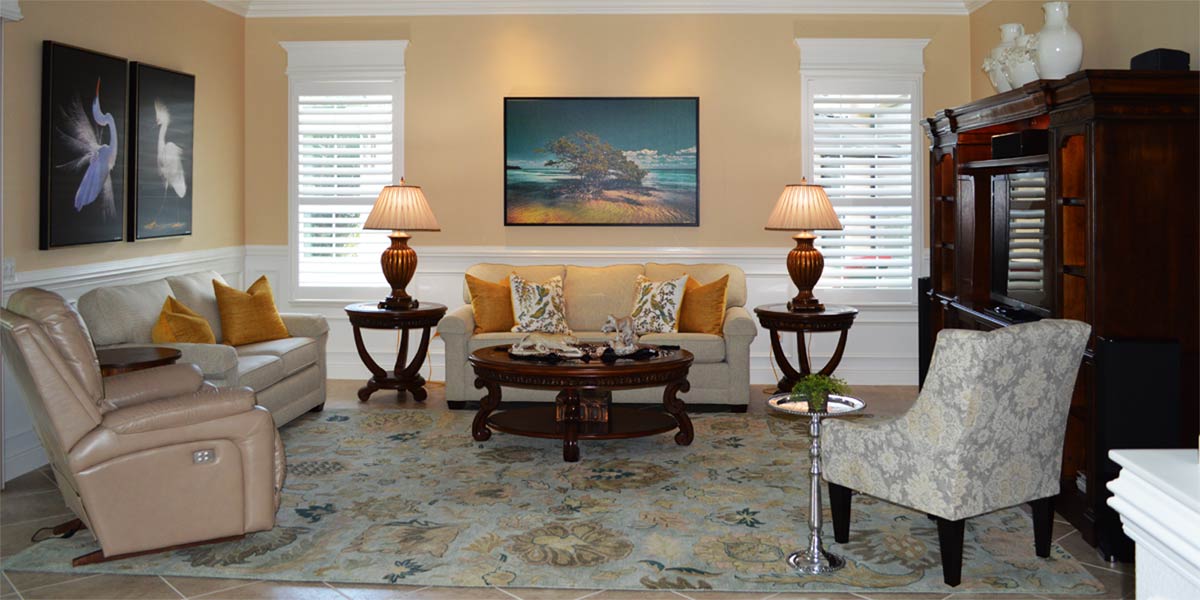
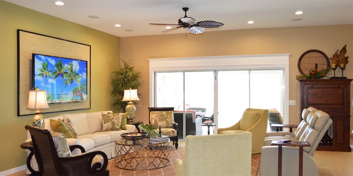
The word “bespoke” sounds like a word that only the elite can appreciate. However, it means tailor made or made to fit a particular person. When fabric was spoken for at a suite shop it was bespoke or “spoken for” and set aside to be tailor made for someone. Today, the term has become a marketing buzz word for elevated products specific to one person but not specific to custom made. So then, when a homeowner purchases things chosen by them and particular to their taste we can achieve a bespoke look by applying design principles that elevate the space. The finished product will look more pulled together, complete and specific to the owner of the home. Let’s take a peek into the living room of a Siesta model to see how bespoke design can elevate a space somewhere in the heart of The Villages.
• Paint Color
As much as the homeowner loved the yellow on the walls she was ready for a change. She wanted a new paint color that was rich, neutral and calming to the space. After hanging large painted samples up and standing way back in the room to see what grey worked best she settled on Repose Gray. This is a rich grey with slight green and taupe undertones. The undertones add depth and warmth to what can otherwise be a cool color. Remember, to always paint the walls in a satin or eggshell finish. These finishes allow light to bounce around the space when conversely flat finishes absorb light and give the walls a chalky look.
• Furniture placement
We re-used all of the original furniture but we needed to shift the living room around. Originally, the sofa was placed as a divider between the dining room and the living room. We decided that it would be better to open the space up so we did that by placing the sofa on the wall between the windows. We had plenty of room to place one chair of each side of the sofa so that the room would invite you in to sit down. Each chair had a different but coordinating pattern that could be better appreciated when the chairs were apart. An open concept home is best when it remains open with traffic flowing freely into each space rather than artificially dividing a room with sofa or chairs.
• Add a rug
The living room needed a rug but we did not want to add another pattern into the room. The space would be best complemented by adding a neutral rug without a pattern. The homeowner chose a natural jute rug to add neutral color and natural texture. This jute rug is soft on feet and great with pets. This rug was offered in a six foot by nine foot size and it fit the space perfectly. Finally, the neutral rug allowed the large starfish pattern of the dining room rug to shine.
• New window treatments
The original window treatments were hung at 84 inch high so they sit just at the top of the window. This height shortens the window by drawing attention to the top of the window stopping the eye rather than leading it upward and working with the height in the space. The sheer fabric was too light and did not pop in the space. We replaced the old window treatments with 96 inch high bright white window treatments. The fabric of the new window treatment looks and feels like linen and they are lined which makes them drape nicely. They hang on the rod with grommets which creates nice folds and an uninterrupted line to the fabric. We hung them at 96 inches high which takes them right up to the ceiling on the right side wall. This makes the room look much taller and the bright white is neutral but it pops in the space.
• Re-hang art
We used all of the homeowner’s current art but we re-hung it for more punch. The large mirror was hung over the buffet in the dining room so that it could reflect all the light from the slider. We hung a large colorful picture over the chair in the living room and a large colorful picture over the sofa in the living room. Each wall was framed by white window treatments which made the white matting on the art stand out and create visual unity between the two pieces.
• TV focal point
We added a floating shelf above the TV in the living room and hung a large clock above the shelf. The shelf color tied into the color of the TV stand so that once the shelf was hung it looked visually connected to the floating wall shelf. Adding the shelf helped draw the eye upward and create a much stronger and more balanced focal point.
• New light fixture
The homeowner purchased a new light fixture and it looks amazing. The new fixture is a woven sphere that is the same color as the jute rug. The sphere is open so that it creates a statement without blocking the view because you can see through it.
P.S. –Attention all club presidents! We give free decorating seminars. It is lots of fun and very informative. Call and schedule your club today. Also, we are on-line check out our web-site at www.ruthdyer.com and you can always e-mail us at ruth@finishingtouchfl.com or Call Ruth your full service decorator at 352-804-2056.
Before and After Pics Below

