 352-804-2056
Coffee, Chocolate and Creme
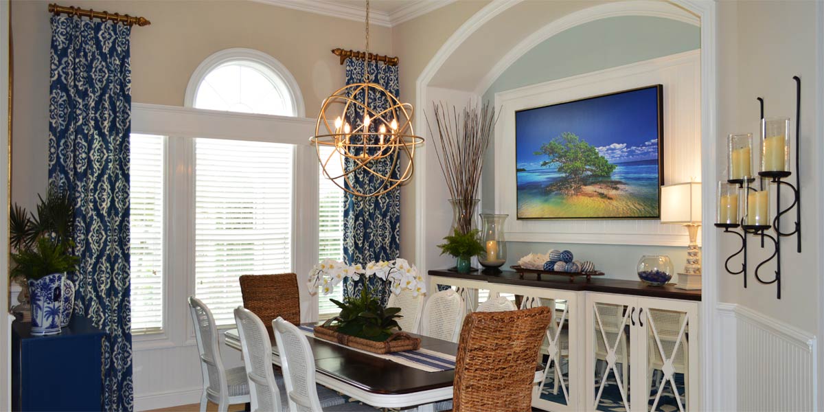
I never indulged in coffee until I was in my mid- twenties. I used to smell the aroma of coffee being made every morning when I was growing up and I loved the smell. I would watch the steam rising from my mother’s hot cup and think that looks like it tastes good. However, when I was finally allowed to taste coffee, it just fell flat on my taste buds. It seemed to always be missing something in the flavor. I discovered what it was when I had my first chocolate latte with real whipped crème on top from Starbucks in my mid-twenties. I needed the note of chocolate to round out the flavor for coffee to make sense to my tastebuds. Now that I am in my fifties and have discovered espresso, I no longer need the note of chocolate to enjoy coffee, but coffee and chocolate do pair well together and I find them hard to resist. In the world of decorating flavors can be expressed in colors and I think coffee, chocolate or crème can be a great inspiration for a room. Let’s peek into the dining room of a Gardenia model to see how the combination of the three colors creates a warm and inviting space somewhere in the heart of The Villages.
• Paint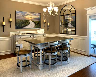
The house was already painted when I arrived, and the homeowners had chosen a color called Coco- whip 9084 for their wall color. This color is a bit darker than I usually use but a very pretty color. The issue that is created by one dark color everywhere is that the house can look dark and without contrast the colors fall flat. To make a color like this shine we needed to add lots of white and create contrast in the space. We achieved this by adding white wainscotting everywhere. If you are considering a wall color that is darker, remember that you must balance the dark with the light. So, be prepared to add lots of white.
• White wainscot
The before picture shows the room with just a band of white chair rail. That was not enough white, so we added a full wainscot. The old chair rail was removed, and a large new chair rail was added to the wall. Below the chair rail we added boxes to the wall created with half round. The entire wall from the top of the chair rail to the bottom of the baseboard was painted a nice bright white.
• Customize the wainscot.
I love to customize wainscot! Usually, dining buffets can run from 36” to 40” inches tall, which would sit above the height of the chair rail. It does not look good if the chair rail runs behind the buffet, so we jogged the chair rail up and around the buffet creating a custom look. This highlights the buffet and makes it look custom to the space. The white in the space now provides light and contrasts to the Coco Whip paint.
• Columns
We added small boxes to the bottom of the columns and painted them white as well. This makes the columns visually cohesive with the rest of the dining room.
• Window
The sliding glass door that leads to the lanai was already cased out in molding, but it did not have a nice large header to really make it pop. We added a large header to pull the eye upward and make the window look finished. This large pop of white framed out the window and highlighted the beautiful view of the golf course.
• Rug
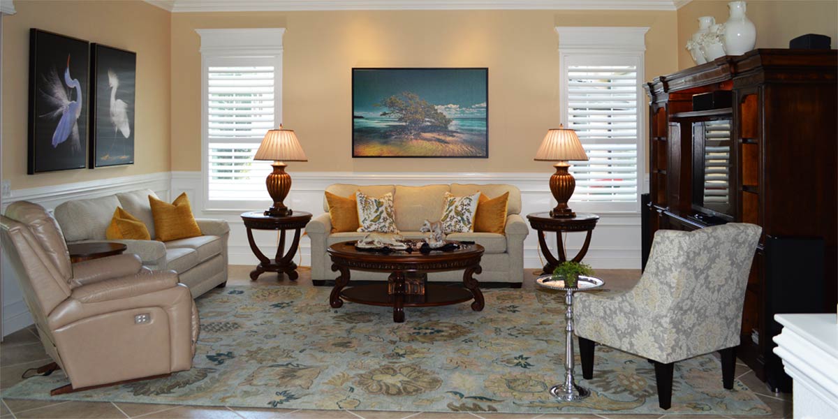
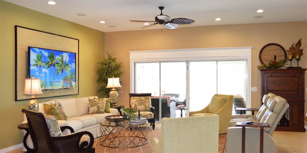
We moved the living room rug into the dining room because it was light. The 8×11 rug filled the space nicely and was a wonderful pop of white on the floor. Area rugs are easy to clean so don’t worry about having one under your table and if you are worried consider buying a washable rug. Washable rugs are becoming more and more popular. I just purchased two for myself and I love the way they perform.
• Mirror
The dining room needed the dramatic effect of another window in the space, but we could not add a window. We did the next best thing and added a mirror that looks like a window. To take advantage of the light coming into the kitchen we needed to reflect the light back into the space. The large kitchen window in this model is an arche window. Adding the large arched mirror to the dining room allowed all that light to be reflected back into the space and the mirror looks amazing. The mirror is 48 wide by 72 high and is shipped in three pieces. If you are wondering if a mirror that size is too big just remember, you cannot have a mirror that is too big because it is reflecting light.
• Large art
We needed a large canvas over the large buffet. We chose a canvas that was 60 wide by 40 high and it makes a huge visual impression. The scene is a sunset with blue hues, white sand and a soft setting sun which is perfect to add light and interest to the space.
• Sconces
Everyone loves the Pottery Barn sconces and so does this homeowner! We added two to each side of the picture and filled them with electric candles that flicker like the real thing. With one touch of the remote the mood is right for coffee, chocolate, and a sunset!
Call Ruth your full service decorator at: 352-804-2056
or Contact Us
Before and After Pics Below

