 352-804-2056
Home Edit
My heart sank with a heavy thud. I felt it drop straight to the bottom of my stomach before it began to race. A light sheen of sweat gathered as I looked down at the red marks scattered across my pages. These were pages I had poured myself into, filled with characters I had imagined and shaped, and now they were covered in circles and corrections. Yes, I had asked for an edit and yes, I had agreed to the process, but it still felt like a punch to see so many notes staring back at me in bright red ink.
I took a breath and reminded myself that these were suggestions, not commandments. I told myself to read through the comments, understand what the editor was trying to say, and most of all to calm down because none of this was life or death. In decorating, much like in writing, it is a gift to have someone who can step in with a clear eye and save you from yourself. Decorators can walk into a room and edit a home with the same steady hand an editor uses on a page, helping you become the best version of yourself. Editing a space is not so different from editing words. You simply have to be open. Let’s peek into a fresh edit of a courtyard villa that is hot off the press somewhere in the heart of The Villages
• Identify what is bothering you
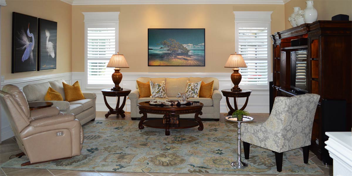
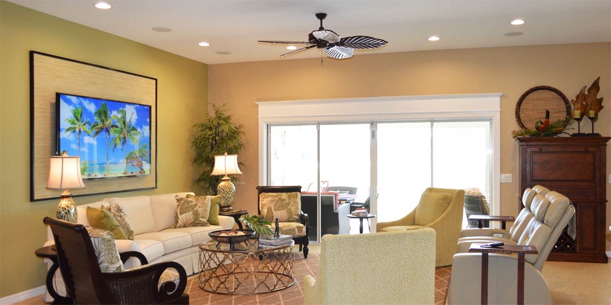
The homeowners were not looking for a full makeover. They simply wanted to refresh the space since it had been ten years since they had made any updates. It is important to keep a home current, especially if you ever plan to sell, because buyers do expect a certain level of upkeep. We agreed the old cornices needed to go. The furniture had become uncomfortable, so new seating was a must. They also wanted to rethink the entertainment unit and bring in updated artwork to give the room a fresh look.
• Windows
The windows were finished with blue cornice boards that matched the furniture. We removed them because, as you can see in the before picture, they felt heavy on the window. They made the window look shorter since the eye went straight to that dark, eyebrow-like shape sitting on top. Instead, we added molding and headers to give the windows more presence and to highlight the view. When a dark element is placed above a window, the light coming through naturally makes it appear even darker. The human eye reads contrast first, so anything heavy or dark at the top of a window becomes the focal point. Light colors around a window allow the eye to take in the entire treatment. With the new molding and headers, the window feels taller and the eye lifts upward and outward to the view beyond.
• Wall Color
The walls needed a touch of warmth, and with the new molding in place, adding color would highlight both the windows and the trim. We chose Patience SW 7555. It is the perfect crème, offering warmth and richness while still feeling light and bright. Its soft golden undertone gives the walls a gentle hint of sunshine. Remember to choose an eggshell or satin finish so the light can bounce around the room and keep the space feeling open and bright.
• TV Wall
The homeowners wanted a larger TV, but their old entertainment unit could not accommodate one. They still needed storage, so they chose a four-piece console that offered more usable space than the original unit and stretched fully across the entire wall. They also purchased a seventy-five inch non-glare TV, and had it mounted on the wall with the wires buried so the installation looks seamless. In this model, when you walk toward the living room, you can see behind the TV if it sits on a console, and it never feels finished. Mounting it solves that problem. If you have this model or a room where the TV sits directly opposite a window, a non-glare screen is the answer. You can watch comfortably during the day and still see a bright, sharp picture without reflections. As a bonus, this TV displays artwork when it is not in use.
• New Artwork
The artwork in the space felt a bit tired, and the homeowners wanted more color. We purchased a beautiful set of bird prints on canvas and framed them in black from GreatBigCanvas.com, and the room immediately came to life. We also pulled several pieces from other rooms in the home and re-purposed them in the living room, giving their frames a fresh coat of black paint. You would be amazed at how just painting a frame black on a picture will not only elevate the picture but complement the art.
• Paint side tables
The side tables were metal with glass tops. Their original white finish made them fade into the room. We had the painters coat the metal bases in black, and they instantly looked richer. The darker finish grounded the tables and tied them into the black accents already woven throughout the space, giving the room a more cohesive look.
• New lamps
The homeowners needed tall lamps for reading while sitting on the sofa. We found a beautiful palm tree inspired lamp in a soft crème color with touches of gold. The palm fronds are finished in gold, giving the lamp a sophisticated look, and it coordinates perfectly with the buffet lamp we placed on the TV console.
• New furniture
The homeowners purchased new chairs and a new sofa, and we brought blue into the room by choosing a soft blue for the sofa and one of the chairs. The second chair introduced a subtle print with touches of blue and soft gray. All of the pieces connect visually to the eight by ten rug, which the homeowners had purchased several years ago, and the room now feels unified through those shared tones.
Call Ruth your full service decorator at: 352-804-2056
or Contact Us
Before and After Images Below

