 352-804-2056
More is More
“More is more and less is a Bore” is a saying that I love! I know that many people subscribe to the thought that less is more but is it? I personally don’t like rooms with very little furniture and find all tile floors to be cold without a rug or two. I think when people hear the saying, “more is more” they might picture a room full of clutter and small knick knacks to dust, but the term, “more is more” can be applied in a larger more grand way, no matter the size of the space. So what if we thought of the phrase, “More is more” as “Larger and less”? Applying larger but less things to a space provides greater visual impact and makes the space feel abundant and inviting. This concept works on any room no matter the size and provides a more finished look. Let’s take a peek into the living room and dining room of an Orchid model to see how “larger and Less” can transform a space somewhere in the heart of The Villages.
• Larger Windows and less Walls
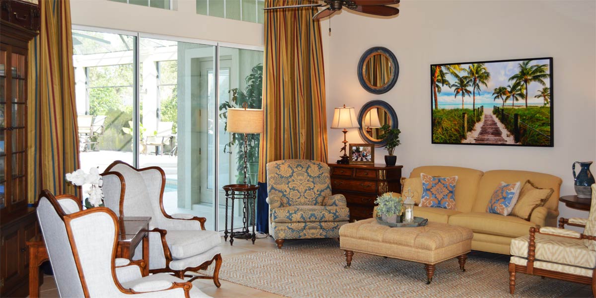
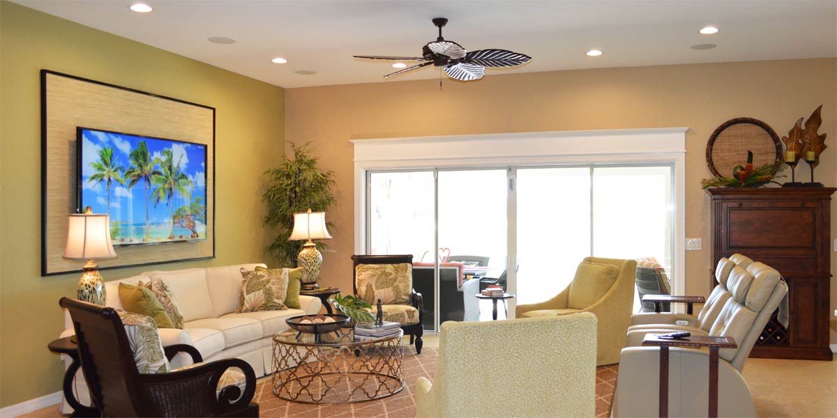
The homeowners entertain and wanted a larger space with more light to host guests. They decided to enclose the back lanai and raise the roof. The entire house was moved out to the end of the existing lanai. All of the walls were removed and the ceiling was raised to allow for a taller and grander sliding glass door. The taller door allows so much of the view to be seen there is very little separation from the outdoors. Also, the windows on the left that belonged to the original kitchenette were opened up and replaced with another bank of sliding glass doors. The room is surrounded by glass and light.
• Casement molding around large sliders
The large sliding glass doors were all finished with large casement molding on the sides of the window and headers at the top of the window. The window becomes a big beautiful picture frame for the view of the golf course. Finally, framing all of the windows at the back of the house to look the same, provides visual cohesion and the windows look finished with no need to add anything else.
• One flooring throughout
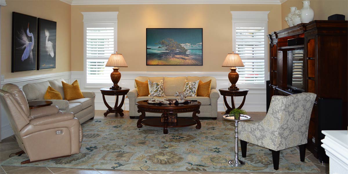
The homeowners selected travertine for the entire space from the front door to the back slider. The travertine was installed without grout and it looks amazing. However, all tile flooring can feel cold without the presence and warmth of textiles in the space. The living room is defined with a large area rug to absorb sound and add cushion for your feet when relaxing. Also, not pictured is a large area rug in what used to be the living room of the original layout and is now a sitting room. Having two area rugs in a space that is fully tiled is a must if possible. There is an opportunity to have a rug placed under the dining room table but it is a personal choice that is made due to the function of the space. The homeowners felt it would be too difficult to have a rug under the table and pull out the chairs.
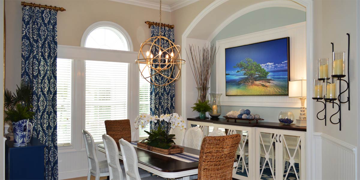
• Large dining table
The homeowners entertain with frequency and a large dining table was a necessity. They did not need two separate eating spaces like the original design but one large space met their needs. This is a great application of larger and less.
• Large open chandelier
The homeowners chose a large chandelier over the large table which is a great choice. The large and open chandelier makes a great statement over the table but allows the viewer to see the view through the chandelier. When the view is the star of the show, don’t put obstacles in the way of the view.
• Built In Entertainment Unit
The homeowners had a custom designed built in media/fireplace unit installed. The color of the unit is creamy white and though it is large it stays light in the space. The unit was created with multiple uses in mind. The large fireplace is perfect for warmth and ambiance. The room is a nice space to have conversation and view the art piece above the fireplace. When the homeowners want to watch TV, a simple press of a button makes a TV rise up from behind the fireplace and cover the art piece in the center. Finally, the side towers were designed to hold the homeowners collection of blue and white ginger jars as well as a substantial coral collection. The display is very pleasing to the eye and contained in a space that can it can be appreciated. The large wall unit is a great example of larger and less. The wall unit is one large piece rather than having a small piece with lots of things around it to fill the wall.
• Furniture placement
The furniture is placed with the sofa directly across from the wall unit. There is a loveseat that matches the sofa placed adjacent to the sofa creating an L-shape or faux sectional. The homeowner placed the loveseat at the back of the room rather than cutting the room by placing the back of the loveseat looking out toward the view. Finally, a chair is angled inward toward the sofa to round out the seating area. I like this set up in most models like this (Lantana or Iris) because it keeps the living room open from the front door and invites people to sit and enjoy. Placing the loveseat toward the view cuts the space and does not invite people to enter the space. This set up does not hide the view because you can still see the view on entry to the home.
Call Ruth your full service decorator at: 352-804-2056
or Contact Us
After Images Below

