 352-804-2056
Tropical Bliss
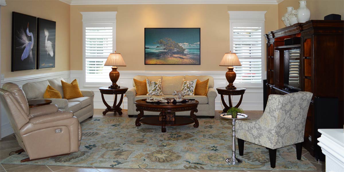
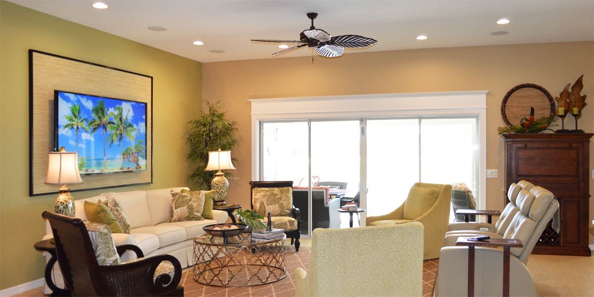
Last week my husband and I went to Key West for a quick 25th wedding anniversary in the heat of August! We attended a small event to see the reveling of a new photo at a gallery on Duval Street and the artist himself was the one to hang the new piece. He lifted the picture high above its hook and lowered it hearing the soft click that meant the slick wire had found its home. He made a few adjustments and the art was leveled. Then, as quick as a rainstorm in Florida he ripped off the cover so we all could see the new piece. The soft hum of the air-conditioning is all that could be heard as we collectively stood back to have the first look. The quiet observation seemed to indicate that everyone looking was mesmerized. But then again, who doesn’t just stop and stare when they see a glowing sun dropping into brilliant teal waters perfectly captured between two palms. The piece, titled “Tropical Bliss” was captured in Key West and as I stared my heart knew that the piece would be mine. I knew that looking at it would always reset my mind to a tropical attitude. Later that day, I thought about the idea of resets, Webster Dictionary says that it is a verb meaning to set again differently. So then, resets could be a simple shift to the left of the right but what about in the world of decorating. Let’s take a look at the master bedroom of a Gardenia model that shifts from traditional tropical hues to cool tropical bliss somewhere in the heart of The Villages.
• The Goal
The goal for the bedroom was to re-fresh the space with new bedding, art and accessories. The furniture was beautiful and had a great island vibe so we decided to keep it. Also, the paint was a beautiful shade of green and we could not think of another color that we would like better so we kept the green. Green is a great color for a tropical look and for the reset we wanted to infuse the space with blue and pops of pink.
• Bedding
I wanted an inspiration piece for the rooms color pallet. We were able to find beautiful luxurious bedding from an online retailer and the pattern was perfect for the space. The bedding had a pattern containing botanicals and birds. The birds looked like birds we see in Florida so the bedding added a casual elegance to the space. We liked the layers of blue in the bedding and decided that we would highlight blues from the bedding. The base layer of bedding is a white duvet that the homeowners sleep under every night. The white will pop against all the other colors in the space. We added three Euro pillows to the top of the bed and they perform two functions. The first function is to hide the sleeping pillows behind the Euros and the second function is to provide a pop of color at the top of the bed. Next, we folded the coverlet that matches the pillows in half and laid it at the base of the bed to provide visual continuity with the top of the bed. Finally, we added a deep teal coverlet folded in quarters and laid it across the bed where the white duvet meets the top of the printed bedding. The bedding contains every color in the space and just a bit more. The bed looks luxurious and inviting!
• Lamps
We added two beautiful blue lamps to the space, one on each side of the bed. Lamps are the earrings in the space that pull everything together. The two blue lamps are the classic gourd shape lamp and the blue color is a perfect coordination with the bedspread. Also, we found two unique pineapple lamps to add to the triple dresser. The white pineapples are hand made in Thailand and are so unique they look like jewelry too.
• Art
We chose two watercolor pictures above the bed that are representations of coral. The coral is painted in layers of blues from soft blue to a hint of navy. When hung together at the top of the bed they create a triangle of color. The pictures visually tie into the lamps and the lamps visually tie into the bedding.
• Botanical by Elizabeth Kershaw
We chose another water color from Elizabeth Kershaw on the wall opposite the bed. The picture is a floral painting of tulips. This picture contains the reds and pinks that are found in the bed spread. Remember, the art should look collected rather than selected based on matching the space. I would not expect each piece of art to have every color in the room like you might see at a furniture showroom.
• Water color by Gene Rizzo
The final piece of art that was collected comes from Gene Rizzo and it is a blue heron. This picture has lots of greens, blues, and a hint of coral. All the watercolors are by different artist but they complement each other well.
• Palm tree
We placed a palm tree in the corner because it looks so tropical and rich in the space. This palm tree is a permanent botanical and will look amazing for years. Remember, when choosing permanent botanicals to pick a realistic looking plant which generally means it may be expensive.
• Beachcomber Basket
Where to place the bedding at night time is often an issue in most bedrooms. We purchased a large basket called The Beachcomber basket and it holds all the bedding at night. I like this basket because it is a beautiful basket and it provides high function. If you don’t want to make your bed the bedding is tucked away and the room still looks tidy. If you make your bed every day the basket looks amazing sitting there empty.
Call Ruth your full service decorator at: 352-804-2056
or Contact Us
Before and After Pics Below


