 352-804-2056
Welcome Color
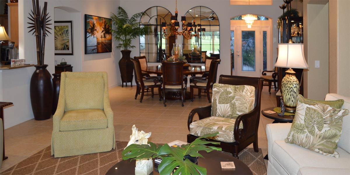
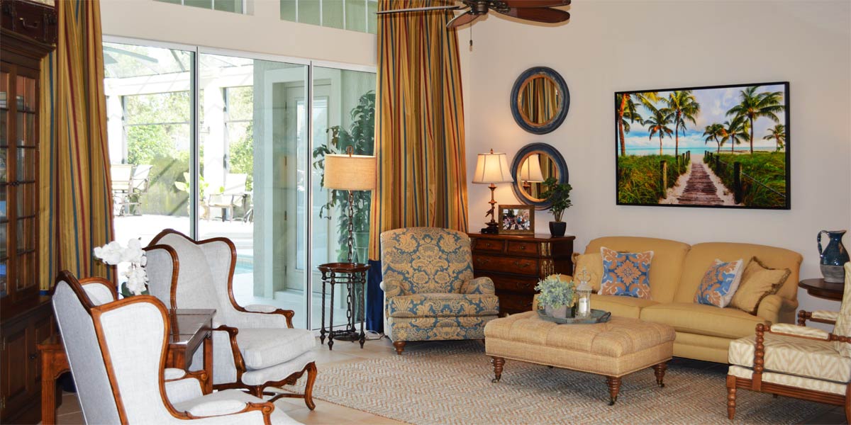
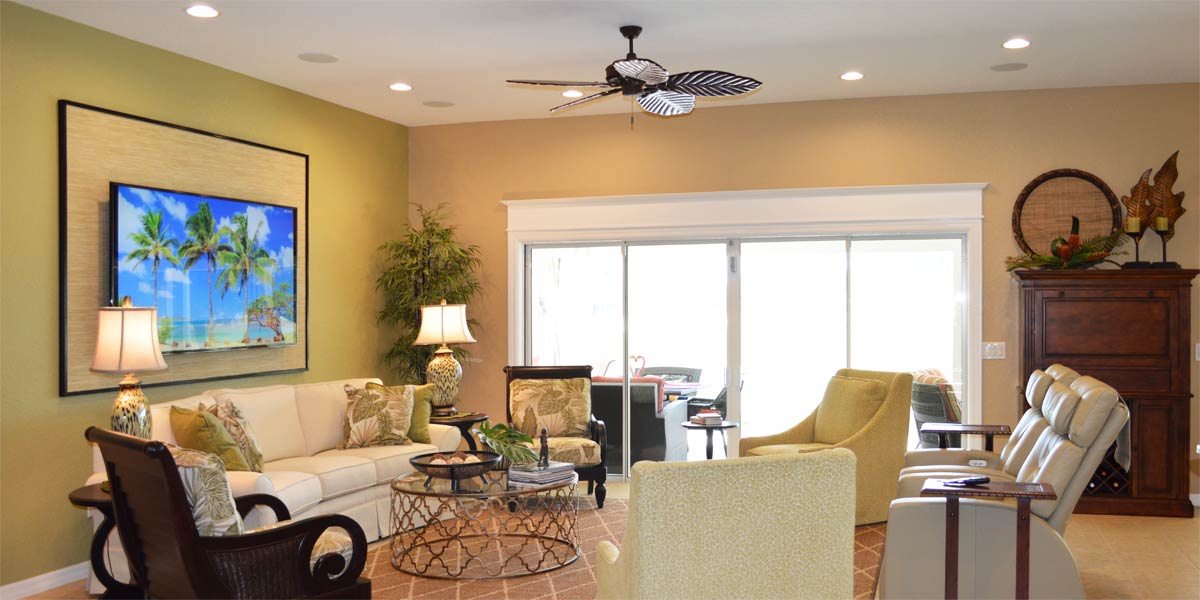
When I started my business over twenty years ago, color was everything in design. Green was the most popular color of the time. You could not keep anything green that you had for sale, it would fly off the shelf. Slowly over time, teals and blues crept into the design space and they worked great with green and everything was fine. The design of lamps was colorful, and the shapes of lamps were amazing with fabulous finishes. Then out of the blue like a ton of wet cement came this overshadowing grey everything. I would hear clients say, “I like color, but my daughter says I should paint grey.” I began to feel that the dark clouds of winter had taken over the world of design leaving our choices dreary with shapeless and colorless lamps. However, I am happy to say that as Spring brings renewal each season color has sprung this season. Color is back and in big, big way! Grey will remain with us in touches, but color is at the forefront of design. Green is being offered a seat at the table again and always complements blue in a space. Let’s take a peek into a Ruby model to see how using color has created a beautiful space that embraces the homeowner and those who visit somewhere in the heart of The Villages.
• Curtains
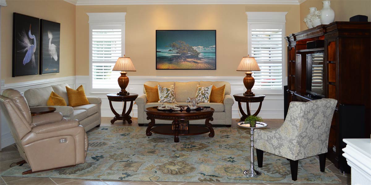
If you read my column regularly you know that I promote molding around windows. However, this homeowner wanted the softness of curtains, and she loved color! I love the use of side panels on windows to make them look taller and wider. These side panels are 96 inches tall and 54 inches wide. The rods are mounted so that the side panel sits at least ten to twelve inches outside the window. The edge of the side panels just grazes the side of the window. They slide onto the rod with a back tab that creates the illusion of a pleat. They are lined and weighted, and they were purchased from an online retailer. There are so many great sources for side panels online and they are made to higher standards than side panels from the past. The homeowner loved the blue and white buffalo check and that was a great jumping off point for designing the room.
• Rug
It is important the that the rug and the side panels have a strong visual connection. This connection creates a common core color that will repeat throughout the space. The rug was purchased from the same online retailer and the rug has a similar blue to the blue in the buffalo check. The pattern of the rug is the antelope pattern that is always classic in design, and it is a wool rug that is naturally stain resistant. The rug is a 9’by 12’ size and it fills the space generously. The more rug that fills the space the better the sound absorption. Pro Tip: Always buy a larger rug. It is perfectly fine to set the furniture on the rug. A larger rug will make the room look larger and once again improve sound quality.
• Sectional Sofa
This space is very conducive to a sectional sofa which the homeowner already owned. We updated the pillows for a fresh look. We chose a solid blue pillow for each pillow grouping. This solid color would ground the groupings by visually connecting them to the rug and the side panels. We chose a printed pillow with flowers and birds to pull all the colors in the room and add a bright pop to the space. Finally, we chose a solid green pillow to bring in the green from the large piece of art in the dining room. The pillow groupings added a fresh punch to the neutral tan sofa.
• Lamps
The homeowner chose small lamps because the side tables are small. The lamps are blue, and they are in the classic gourd shape by Suzanne Kasler. This shape works so well in any space and the color is so much more exciting than grey or brown lamps.
• Fabric cow head
The fabric cow head is embroidered with many colors. This piece came with the homeowner from her Texas home, and she was so happy it found its new home in a place of prominence.
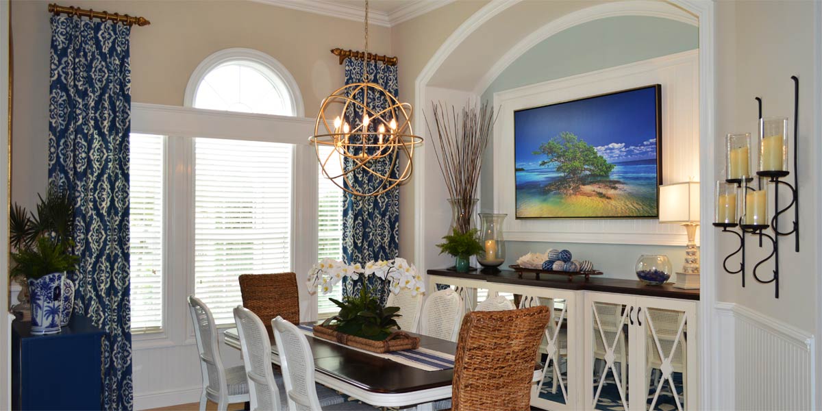
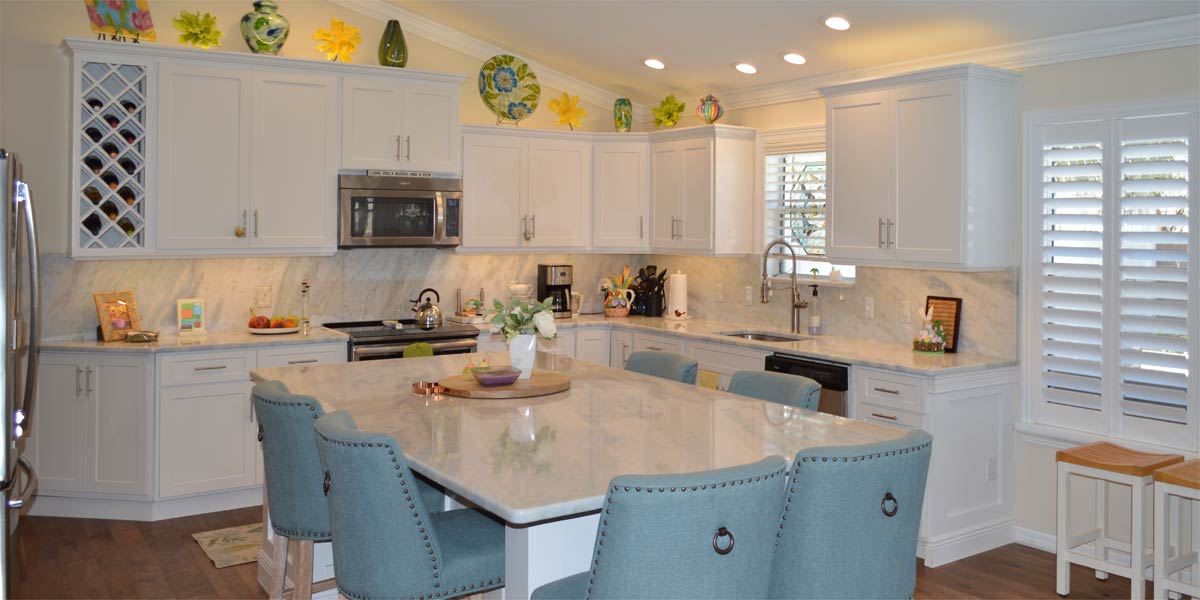
• Dining room table
The homeowner already owned the dining room table, and the white color was nice, but we needed more function and more color in the space. In the Ruby, Colony or any model with this type of dining room, I recommend a fully upholstered bench in front of the window. We chose a solid blue bench that visually connected to the other blues in the space. The bench allows the table to be moved back toward the window so that two people can slide onto the bench. Sliding onto the bench keeps you from needing room in front of the window to pull out chairs. This is like sitting at a banquette in a restaurant. The chairs on the other side of the table have more space to be pulled out and the people have a larger walk space around the table. The fully upholstered bench is very comfortable, and my customers say they love eating and watching TV from the bench.
• New used buffet
The homeowner needed a larger buffet that had closed storage, and it had to coordinate with her current set of furniture. We took a quick look at Marketplace, and we found the buffet nearby that coordinated with her current table and she purchased it. The buffet is solid wood that was refurbished.
• Large arch mirror
The large arch mirror that is 48” wide and 72” high was hung above the new buffet and the space received a healthy dose of light! All the light reflected by the sliding glass door looked beautiful in the space.
• Beau Orb
The Beau orb is no longer in production, but the homeowner found one second hand online. We hung the light high so that we did not have to center on the table. The chandelier coordinates well with the mirror.
• Art
The artwork was the perfect cherry on top to finish the dining room. The large graphic collection of cacti pops off the canvas and is a favorite piece from the homeowners’ Texas roots.
Call Ruth your full service decorator at: 352-804-2056
or Contact Us