352-804-2056



Low Demo Renovation
Do you hate your guest bathroom. When you’re in there does your mind wander to what it could be. Are you simply tired of the same look you’ve lived with for ten years. Most people come up with plenty of ideas to recreate the bathroom but then picture the mess those ideas will create in their home. What if you could have a bathroom that looks like it was gutted but it was not. You do not have to tear your bathroom apart to create a space that feels completely renewed. Most bathrooms don’t need a demolition crew. By subtracting a few things and adding a few others, the room can look modern, fresh, and elegant again. It is entirely possible to walk into your bathroom one morning and think it looks like it had a full renovation, even though not a single tile was harmed in the process. Let’s take a peek into the guest bathroom of a Gardenia model to see how a low demo renovation created a modern and elegant guest bath somewhere in the heart of The Villages.
• Goal of the homeowner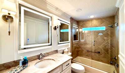
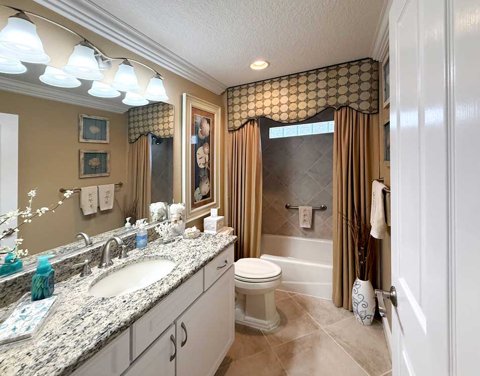
The bathroom had good bones, but its finishes were beginning to feel dated, and the homeowners were ready for a space that felt fresh, bright, and visually larger. They were drawn to the idea of crisp white walls but worried that an all-white envelope might feel stark or flat. They also wanted to eliminate the heavy shower curtain and cornice to open up the room, and they knew the mirror and lighting needed an update, they just weren’t sure which direction to take.
• Glass shower door
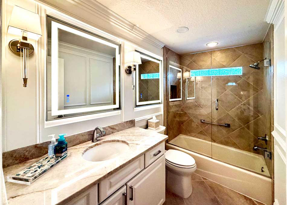
Removing the curtains and the cornice was the first step because the eye needed to move through the room without interruption. A glass door allows the tile to be seen and opens the entire space visually. The homeowners selected a glass panel with a door that can swing in or out, which keeps the entry simple and easy to use. They also chose to take the glass higher than usual. This helps the room feel taller because the eye continues upward rather than stopping at a short panel. They decided against a sliding glass system because the hardware at the top creates a visual break, collects dust, and is difficult to clean.
• More mirror
To keep the eye moving through the room and make the space feel larger, the homeowners agreed that adding molding above the sink and carrying it all the way to the new glass door would create a subtle illusion of a longer countertop and a more expansive layout. Instead of filling the second framed section with artwork, we chose a second mirror to reinforce that sense of openness. The molding frames both mirrors beautifully, giving the entire area an elevated, spa-like calm.
• The mirrors
I love these mirrors. They have a slim protective frame that is barely visible, running around the outside edge to keep the glass safe. Each mirror requires an outlet behind it so it can be plugged in, and they operate from a wall switch. They also include a touch control on the glass that lets you adjust the light temperature, and the built-in anti-fog feature makes them even more practical.
• New lighting
The lighting in the room didn’t just change, it truly improved. The problem with lights positioned directly above the sink is that they cast light downward, which creates shadows at the very moment you want clarity. By removing those overhead fixtures and installing a ceiling light that spreads a soft, even glow across the room, the entire space feels more balanced. From there, the lighting becomes layered. The lighted mirrors shine forward, directly onto the face, removing every trace of shadow for a more beautiful image staring back at you. The final touch is the pair of lighted wall sconces on each side of the mirror. The generous molding supports them beautifully, and the light they add is soft. Together, the three sources create a space that feels well thought out, flattering, and much more enjoyable to use.
• New countertop
The homeowners did want a new countertop which is very easy to have installed and creates very little dust. They chose a remnant of Taj Mahal, and it is beautiful. Taj Mahal is a natural quartzite from a quarry in Brazil, it has warm creamy coloring, soft veining, and durability that makes it a favorite for bathroom countertops. It’s often chosen by homeowners who want the elegance of marble without all the worries.
• Applied molding
The remaining walls were finished with applied molding, creating a series of clean, structured boxes that add texture and visual interest to what would otherwise be flat surfaces. This treatment gives the room a more tailored and architectural feel. Painting both the walls and the molding white keeps everything bright and cohesive, allowing the details to stand out without overwhelming the room.
• Niche
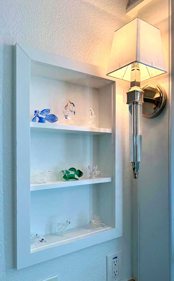
The medicine cabinet was removed, and the woodworker created a small built-in shelf niche that can hold spa items or decorative pieces. It turns what used to be a plain, utilitarian spot into a useful detail, making sure no part of the wall goes unused.
Call Ruth your full service decorator at: 352-804-2056
or Contact Us
Before and After Images Below