 352-804-2056
Change is good
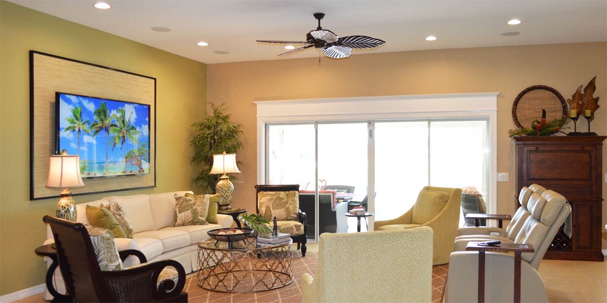
I often hear that “change is good”, but what if the change is not good? I don’t like trying a new meal at a restaurant and not liking it. I don’t like getting a different haircut and crying when it is done. I don’t like buying low fat cheese by accident because I did not read the package! So then, the life lesson is that change is good when it is good change. In the world of decorating, change can be good but all change equals money and we don’t want to waste money. Let’s take a peek into the living room of a Gardenia Model in which the homeowners had an idea of what they wanted but they needed help to bring it all together and make good change somewhere in heart of The Villages.
• Goals
The homeowners liked a traditional style and window treatments. The large cornices and side panels were loved for many years but now they wanted to lighten up without getting rid of everything.
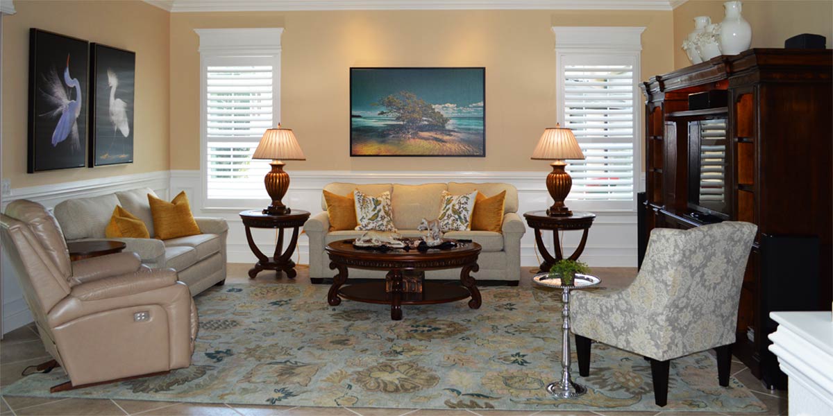
• Remove the Red cornices and add molding
The large cornices were pretty but as with most strong dominating colors, particularly red, people grow tired of them. The homeowners were looking for an alternative to large cornice boards but they still liked the use of textiles in the space. We decided a dual approach to the windows would work best for them.
• Window treatments plus molding
The large slider did not need a privacy treatment and that window always looks amazing with large white molding and a header on top. When the window is completely cased out and painted white it acts as a picture frame around the view visually drawing you into the space. The molding also acts to draw the eye upward and out so that the window itself seems larger, lighter and brighter. The small windows in the living room received casement molding only to define the windows. The homeowners wanted decorative side panels of pretty fabric to adorn the windows as well. They chose a beautiful linen fabric that had small leaves of varying colors embroidered into the fabric. The colors ranged from coral, a color the homeowners hoped to add to the space, burgundy and green. The light colored fabric allowed the windows to remain light as well.
• Add crown molding
Seven and a quarter inch crown molding was added to all the main areas of the house to make the space look finished and brighter. If the ceilings of a home are taller than nine feet the larger crown looks better in the space. When the ceilings are eight feet the smaller five and a quarter inch crown molding looks better. It is a matter of scale the further away molding gets the smaller it looks so higher ceilings equal bigger molding.
• Furniture placement is key
The large entertainment unit between the windows was making the room look very dark. When we moved the unit off the wall between the windows and placed it on the wall opposing the sliders the room instantly looked brighter. We placed the sofa on the wall between the windows. The sofa is dark but it does not look as dark against a light wall. The gold chair and the recliner were placed opposite the media unit and those are the chairs the homeowners liked to sit in to watch television. This furniture arrangement made the space look open, light and large.
• New accent chair
We needed a third chair to balance out the space and the homeowners purchased a coral color chair to complement the curtains and new rug. The chair was perfect and helped pull the coral color around the room.
• New Rug
The old rug had too much red to keep in the space. The homeowners chose an eight by eleven foot rug that also incorporated all the colors from the window treatments. The rug was a pattern of small stripes and a more modern print than the former rug. The rug helped to brighten the space and pull all the colors together.
• New art
When the sofa was placed on the wall between the two windows that opened up a large space for art to be displayed and establish a strong focal point in the space. The homeowners chose a large painting of a pond with flowers and foliage. All of the colors of the window treatments are found in the art. The large art on the wall is the final piece that pulled the room completely together and created a more finished feeling.
• Refurbished lamps and clock
The homeowners liked their clock and their lamps but both were so dark. I suggested lightening them by applying gold to darkest parts of the lamps and clock. They were able to do that on their own and I think that the lamp and clock refurbishment worked. The lightness was just enough to make the pieces look new again.
P.S. –Attention all club presidents! We give free decorating seminars. It is lots of fun and very informative. Call and schedule your club today. Also, we are on-line check out our web-site at www.ruthdyer.com and you can always e-mail us at ruth@finishingtouchfl.com or Call Ruth your full service decorator at 352-804-2056.
Before and After Pics Below

