 352-804-2056
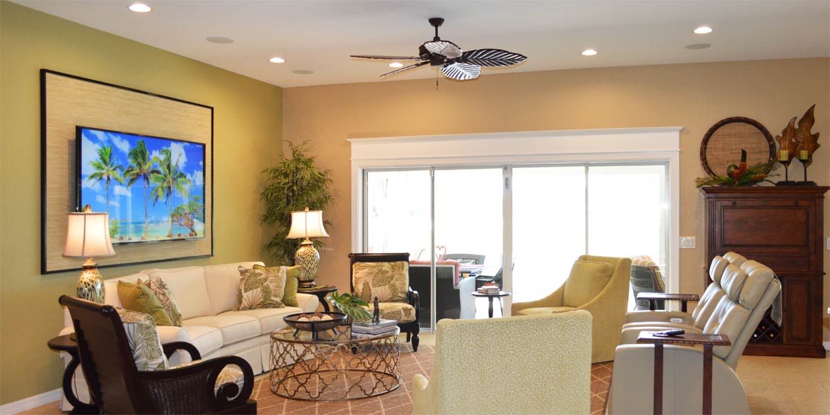
Larger and Less
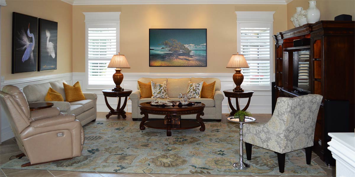
It is often said that less is more but I have some difficulty with that. Is it? Is it really? When I see tiny little lamps on each side of a bed they look out of proportion. When I see one pillow placed at the top of the bed it looks sparse. One small picture on the focal wall looks like college dormitory days. So, I don’t always agree that less is more but it can work if the scale is good. Scale and proportion can be tricky and must be learned over time through practice and application. Rather than focusing on “less” I like to focus on the idea of larger and less. When you apply larger items but less of them to a room you get visual impact, abundance, and a finished looking space. Let’s take a peek into the guest room of a St. Charles model to see how larger and less create a beautiful room ready for springtime visitors somewhere in The Heart of The Villages.
• Visual Impact
If you want to use less in a space then the things you use should be larger. I often will ask a customer if they have any large art and they will show me a picture that I would consider medium. So elevating a room to larger and less can be a bit scary if you are not used to large art and large lamps. I find that if I hang a picture that someone fears is too large, and leave it in the space for a week; they get used to the large size and begin to see how nice it looks vs. one small picture.
• Furniture in the space
The furniture consists of a king size bed, two side tables, a tall chest of drawers and a triple dresser opposite the bed. The homeowner did not purchase the matching mirror to go over the triple dresser because the TV is mounted on the wall above the dresser. The principle to notice is that the pieces of furniture are substantial. The side tables are large enough to look in scale beside a king size bed. The room is big enough that it could accommodate two more large pieces. Typically customers will try to fit in lots of little furniture and then the room looks cluttered. Larger furniture and less of it works great in most spaces.
• Paint
Often homeowners want to paint one wall as an accent. The better approach to a room is to paint all the walls one nice color. But if you really want an accent wall, paint that wall one or two shades darker. The key takeaway is to paint all the walls in the space. The homeowners chose the color Window Pane 6210 this is a neutral green based blue and it goes with anything. I particularly like it with a range of blue accents.
• Trim out the windows
The windows needed to have some character and a finished look. We added large casement molding around the window and a removable crown molding valance at the top of the window. The valance blends into the casement molding seamlessly and can be removed to change out the blind if needed. The white casement molding pops out against the window pane colored wall and creates a framework for the bed and the art.
• The art
The homeowners chose a custom sized canvas from Alan Maltz, titled “Endless Journey”. This piece was photographed on a private dock on Sugar Loaf Key and it creates a great visual above the bed. One could just stare into the picture and dream of being there on the dock. One large picture above the bed creates such a great visual pop in the space.
• The bedding
The bedding is luxury redefined in natural and casual linen textiles. The base layer of bedding is white and it is a channel stitched coverlet that feels so soft to the touch. I had already convinced myself that if they did not like it I would keep it because it was so soft. However, they loved it and it will be so appreciated by guests. The accent bedding is the Granada printed shams and coverlet from Serena and Lily. The large print pays homage to classic Indian botanicals printed on the softest linen and cotton combination that I have ever felt. This quilt is casual luxury re-defined. The print is amazing by itself so we added four Euro pillows along the back of the headboard, and two king shams in front. Finally, we added the quilt folded over at the end of the bed. The repetition of the print creates a statement without overwhelm because we just kept repeating the print in different ways.
• Lamps
The lamps are pieces of art and they are substantial so they look right beside a tall king size bed. The lamps are handmade from Thailand. They are white with small petals of royal blue surrounding the base of the lamp. The tan shades visually tie into the tannish color of the dock in the photograph. The focal point of the room looks finished but not overdone and very inviting.
• Mirror
We hung a large metal framed round mirror over the tall chest of drawers so that we could reflect light as we entered the room. The large arrangement of white orchids looks great with the light from the mirror behind it. The orchids are Winward and will always look real and in the height of their bloom, even if you go cruising for a month.
• Guest bath
The back wall of the guest bathroom can be seen as you look into the room and the homeowners wanted an accent wall to look cohesive with the bedroom space. We used the Granada print wallpaper in reverse on the bathroom focal wall. In keeping with my principles of treating the other walls, we found complementary “grass cloth like” wallpaper that looks perfect with the accent wall. The grass cloth paper we chose is actually string on paper. The strings are white and soft blue and they look like grass cloth which blends so well with the accent wall. We love the print and the texture in the space. The guest bath looks so pulled together and connected to the guest bedroom. Wallpaper is back and there are so many choices! If you are looking to flex your decorating muscle consider a space with wall paper.
Call Ruth your full service decorator at: 352-804-2056
or Contact Us
Before and After Pics Below


