 352-804-2056
Maximalist Design
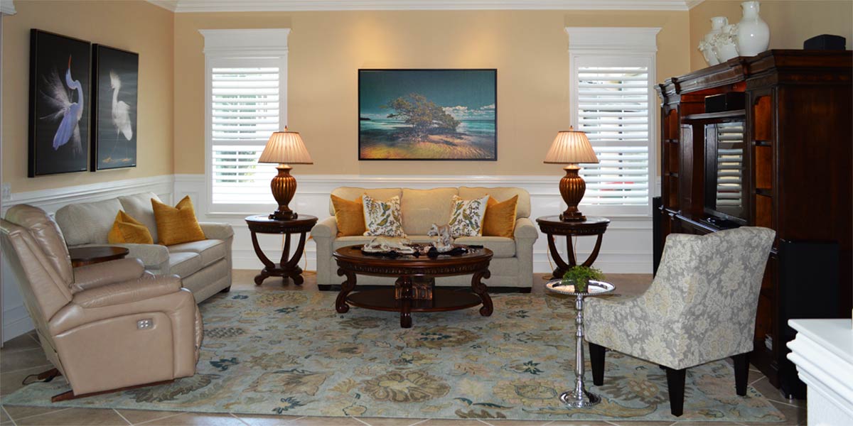
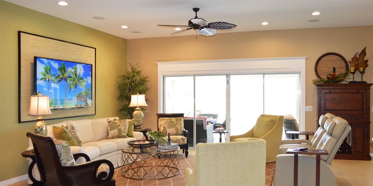
I don’t have an exact account, but it seems like for the last ten years in design there was a big push to minimize the look of spaces. People wanted less accessories with more open and usable surfaces so as not to be distracted by “stuff”. I would often hear, “Well I believe less is more”, or “You can’t image how much stuff I got rid of in my house up north and I don’t want to go there again.” That is fine for those who want to have less stuff so that they can travel and enjoy golfing every day to bring them joy but what about everyone else? What if you receive pleasure going to antique malls and vintage markets hunting for treasures that bring you joy? There is a design category for you, and it has been around much longer than minimalism because it is the exact opposite, and it is called Maximalism! Yes, maximalism is a thing and it is coming back strong! Maximalism celebrates excess and the art of having more. So, if you have been shamed for your love of stuff don’t be shamed anymore because as the queen of excess in design and fashion, Iris Apfel says, “More is more and less is a bore!” Let’s take one final look into the living room of the Mandavilla model from last week to see how maximalism can be inviting, interesting and warm somewhere in the heart of The Villages.
• Focal Wall
The Mandavilla living room wall is very large and it is the first thing that you see when entering the space. This is a great wall to highlight but the homeowner wanted to do more than just paint another color. I suggested the application of board and batten to the wall and that it should be painted completely white. The textural pattern of the boxes provides visual interest and the color white pops in the space.
• Trim around the large window
The large window in the living room of the Mandavilla model is also something to be highlighted. We had the window trimmed out with large casement molding so the window would stand out. The large white molding and header at the top draw the eye upward and balance nicely with the size of the large focal wall.
• Wall color
The wall color in the living room is Livable Green 6176. This is a green that is lively and warm at the same time. The ever so slightly blue undertone with hint of grey makes this a very usable neutral for so many styles. I like it because that hint of blue keeps the green from becoming dull. The paint finish was a satin finish so the light would bounce around the space giving the green a rich depth of color. Also, the walls received two coats of paint.
• Furniture
The homeowner had two reclining pieces, a love seat, and a sofa which he placed in an L shape which works well in this space. The loveseat looks best at the back of the space so that it minimizes the size of the piece, and it does not cut off the room in that position. The golden tan color of the leather looks great against the white wall.
• Massage chair
The massage chair was the one item that had to remain in the space. Though it is large and dark brown it does blend into the space well. I understand the need to have things in a space that really function for the homeowner and this chair was very much needed on a daily basis. Part of maximalism design is to have comfort in a space. The idea that everything does not have to be perfect and that sometimes comfort comes before aesthetic.
• Side Tables
The homeowner had two side tables and a small coffee table, but they were very different and not working well together in the space. We painted the two side tables white and added black granite to the tops of all three pieces. Though the coffee table was not white the black granite on all three pieces created visual continuity to the space. The black granite also elevated the pieces of furniture.
• TV console
The TV console was a wonderful piece of furniture from the Campaign style era in design, but the wood was not in good shape. The homeowner had the piece painted white and we added black granite to the top of the TV console. The addition of granite to all the pieces made them look cohesive and pulled together.
• Large art
The large piece of art over the sofa is from Alan Maltz and it is titled, “Violet is the Night” presented in the Old Florida Style of Sepia tones. This piece is framed in a black frame with a black silk liner that highlights the picture to perfection. Though the picture is a photograph, it looks like an old oil painting.
• Pineapple Lamps
The lamps are the jewelry in the room, and we needed fantastic jewelry. The homeowner chose two large white pineapple lamps with black shades. The lamps are made by hand in Thailand they are stunners in person. The use of unique and eclectic things is so important when your style is maximalism.
• Rug
The rug is a traditional patterned rug that is built for wear and tear. This is from Karastan, and it is the smart strand series that is designed for performance. We purchased a 9’ by 12’ rug and left plenty of walkway to move through the room. Remember, large rugs make the room look larger.
• Collections
The homeowner has a big collection of Chinoiserie, Foo dogs, and coral. He has displayed pieces in groups so that they can be appreciated as a group. The key to showing collections is grouping collections. Try to avoid filling every surface with a collectible. Choose a few spots to highlight your collection so they can be appreciated as one moves throughout the space.
• Permanent Botanical
Permanent Botanicals are back! The use of faux bamboo and faux palms is on the rise again and I really like it. The homeowner is a great gardener and real plant lover who never dreamed that he would allow a faux plant into his home but now he has two. Once he was able to see how real the permanent botanical looked, he was hooked.
Call Ruth your full service decorator at: 352-804-2056
or Contact Us
After Image Below
