The Grande Finale
Have you ever sat on your couch and just looked around your living room? You scan the windows and then look to the walls and as your eyes move to the floor there is a feeling of overwhelm because you know something is missing but you don’t know what. You may catch a show on HGTV that shows a finished room and think to yourself, “that is what my room needs”, that will finish the space nicely. You may be out shopping, and you end up in the pillow isle looking at all the pillows and you think, “let me just get a few of these pillows and that will make the space feel done. What if you paid big bucks to have professional window treatments installed and yet still something is lacking? The answer is always found in applications from the ancients. The Greeks and the Romans relied on architecture and wall treatments to define a space and we still do today. Textiles are so important but on their own they can seem a bit lacking. Let’s peek into the living room of a Grandview Model to see how a space can achieve a finished look when the world of textiles and architecture collide somewhere in the heart of The Villages.
• Window treatments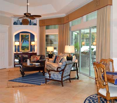
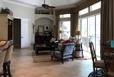
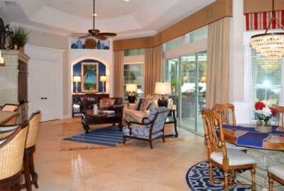
The window treatments were just beautiful in the space. They framed the window nicely and they raised the eye to make the space feel larger. The fabric was a nice straw-colored neutral, and color popped at the bottom of the panels. The application of fabric textiles to the space adds softness, definition to the window and a bonus is sound absorption. So many houses have tile floors, and the sound reverberates everywhere. When fabric treatments are applied to the space the sound calms down and everything feels more balanced.
• Create architecture
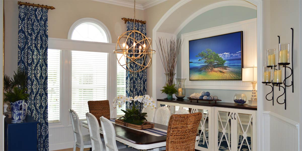
The addition of architecture to a space has been a timeless tradition since the days of Emperors and Kings. When walking into the living room, the first thing in the line of site is the niche at the back of the room. We decided to highlight that area and make it pop. We added molding to the entire surrounding area of the niche and created columns on each side. The white highlighted the niche area and made it stand out.
• Paint niche
We decided to pepper the living room with touches of the Loyal Blue SW 6510 to visually tie the space together. The loyal blue is found in the print at the bottom of the curtains and on the accent chair in the living room, we wanted to move the color around the room creating a rhythm of blue as an accent.
• Molding on the master bedroom door
When looking to the back of the space, the entrance door to the master bedroom can be seen as well as the niche. Since we added molding to the niche making it look large, the master bedroom door had to look visually cohesive with the niche. We added a header and large molding on each side of the door so the door would look like it had proper visual balance beside the niche. Now when you enter the space there is a sense of balance between the height of the master door with the height of the niche. Also, there is a slight movement up with the eyes to the window treatment, but the space is very balanced visually.
• Large art in the niche
We added a tall picture titled “Latitudes” to the space in the niche. The art looks amazing on the blue wall. We added two lamps on each side of the art and the glow of light on the blue looks like a touch of sunshine.
• Pot shelf above the niche
We left the back wall of the pot shelf of the niche white. By doing this we would not visually compete with the widow treatment and the space would look great with blue pots that pop against the white.
• Glass to cabinet
The cabinet in the niche is a storage cabinet but it had clear glass, and everything inside could be seen. We had a glass company put mirrors in the doors. The mirrors will reflect out and hide all the storage items and visual clutter.
• New Pillows
We stored away the pillows that came with the sofa and purchased new pillows. We added three to each side of the sofa. All the pillows coordinate with the space and are a variety of colors. Just replacing the pillows added much needed color to tie the rooms together.
• Layered rugs
The homeowner had a very large existing jute rug, and we loved it but we needed to add color. We added a thin wool 5×8 rug at an angle on top of the jute. This added a splash of color that reinforces the movement of blue.
• New lamps
We replaced the living room lamps with navy blue glass lamps. The lamps look amazing in the space.
• New chandelier
We added a new chandelier to the kitchenette area. This chandelier is a bronze base with dangling glass. The look is sophisticated yet casual and it really pulls the space together.
• Small niche
We added large molding to accent the small niche and we painted the back wall of the niche Loyal Blue. This little niche helps spread the blue throughout the space.
• Kitchenette
The small eat in kitchen had professional window treatments but they did not completely define the window. We added large molding around all three windows in the space. The existing valence looked more impressive because it was supported by the visually unified window below.
• Wainscot
We added a bead board wainscot to the bottom half of the kitchenette wall. The wainscot tied into the windows and was installed on the three walls of the kitchenette space. The kitchen and kitchenette are two separate spaces but share visual elements that tie them together.
Call Ruth your full service decorator at: 352-804-2056
or Contact Us
