Convergence
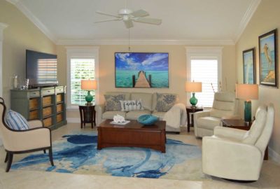
I am not sure how long you have to live in Florida before you are a victim of convergence happens to almost everyone. Webster’s dictionary defines convergence as, “independent development of similar characters often associated with similarity of habits or environment”. So then, the longer you are exposed to the sun soaked skies of Florida and its wonderful scenic views of nature, the more you want your interior environment to reflect the exterior environment. When does convergence actually happen? When does the vanishing point occur and you give yourself to the light Florida life? I think it is subtle but often realized deep in the night when sleep alludes you and all you can think is, “ I am tired of my dark house and I want new artwork!”, It is at that point, that singular vanishing point that rebirth occurs and you emerge a true Floridian! Let’s take a peek into a Gardenia model living room that has converged, vanished and emerged as a light bright Floridian home somewhere in the heart of The Villages.
• Repaint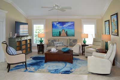
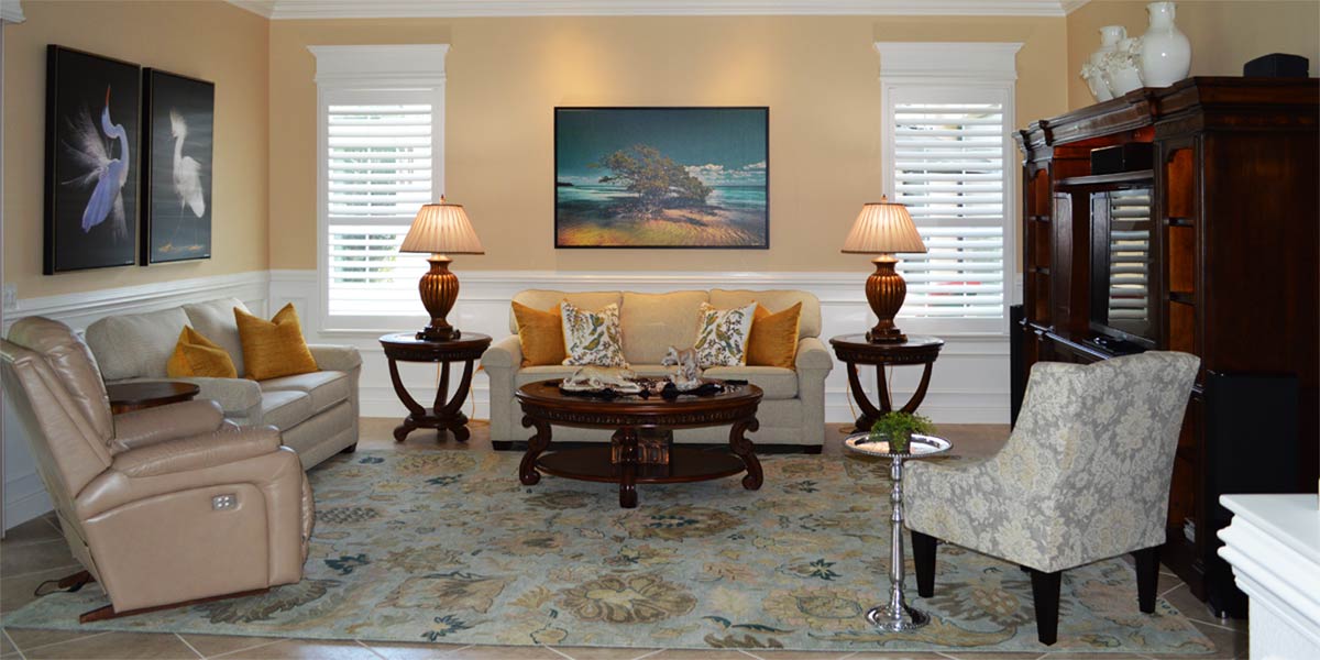
We had to repaint to lighten up the space. The former color was a green based caramelized tan. The color was pretty but absorbed light and we needed a color that reflected light. We chose Patience 7555 which is the perfect tan, crème with a hint of yellowish gold. That hint of yellowish gold is what keeps the paint lively and reflective rather than absorbing light. Paint samples on large poster board halves and place them around the house, a clear winner of your choices will emerge.
• Molding
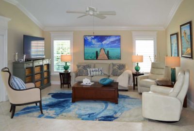
We installed seven inch crown molding around the main body of the home and it finishes the transition from ceiling to wall beautifully. We also installed shutters and added a header to the top of the shutter. Finally, we trimmed out the large sliding glass door with casement molding and added a header to the top of the door. The matching headers of the windows and slider provide visual cohesion in the space and provide a customized finished look to the windows.
• Relocate the TV
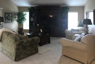
We had to move the TV off the wall between the windows. The light shining through the windows makes everything in front of the light look darker. For that reason, the entertainment unit looked darker and more imposing than it really is in the photograph. We removed the entertainment unit and purchased a buffet type cabinet to use as the TV console. The cabinet came with lots of open shelving but open shelving can tend to look cluttered if filled with lots of stuff. We found woven grass baskets that were all the same color and fit the cubby holes as if they were made for the cabinet. The color of the baskets visually ties to the dock in the artwork above the sofa and re-enforces a light casual look.
• Sofa
The homeowners purchase a new sofa in a light greyish tan and it looks amazing and light between the windows. The sofa and artwork will make a fabulous focal point.
• Two recliners
The homeowners bought two new recliners so they can be super comfortable while watching TV. The recliners are placed opposite the TV so the homeowners have a straight line of sight for maximum comfort. The key to making the new recliners work is they must be wall hugging. The chairs move into the room and away from the wall when in reclining position. This allows the chairs to be close to the back wall.
• Art
The stunning picture over the sofa is titled, “Endless Journey” by Alan Maltz. This is a dock on Sugar Loaf Key that is a part of a private residence. The artist used, “an extreme angle lens to accentuate the vanishing point, almost blending into the horizon.” This photograph and the idea of vanishing points inspire rebirth and embracing the Florida life. We hung two birds from Gene Rizzo in amazing blues as complementary wildlife pieces to Endless Journey and the colors look amazing together.
• Glass Lamps
We placed glass lamps on each side of the sofa to tie into the green water of the photograph. Also, we placed a blue translucent lamp between the recliners that visually ties to the bird pictures.
• Rug
The rug is absolutely perfect for the space. The blue splashes of color make one think of water pooling in soft sand. All the blues in the space are balanced with the crèmes tones of the furniture, carpet and walls to create an inviting and comfortable space.
• Occasional chair
We rounded out the seating area with a comfortable yet movable occasional chair. This chair needs to be flexible as it will fill many needs. It must look good, be comfortable and accommodate the needs of different guest. We stuck with crème upholstery and topped it off with a pillow to pull the color around the space.
• Pillows
The pillows on the couch were a bit of an investment but we loved the embroidered blue coral on the fabric. You don’t find these pillows everyday so they were a wonderful splurge and for the finish we added a pillow reminding us the importance of Family.
Call Ruth your full service decorator at: 352-804-2056
or Contact Us
