 352-804-2056
The Balance of White
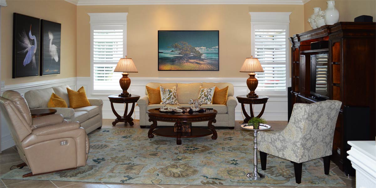
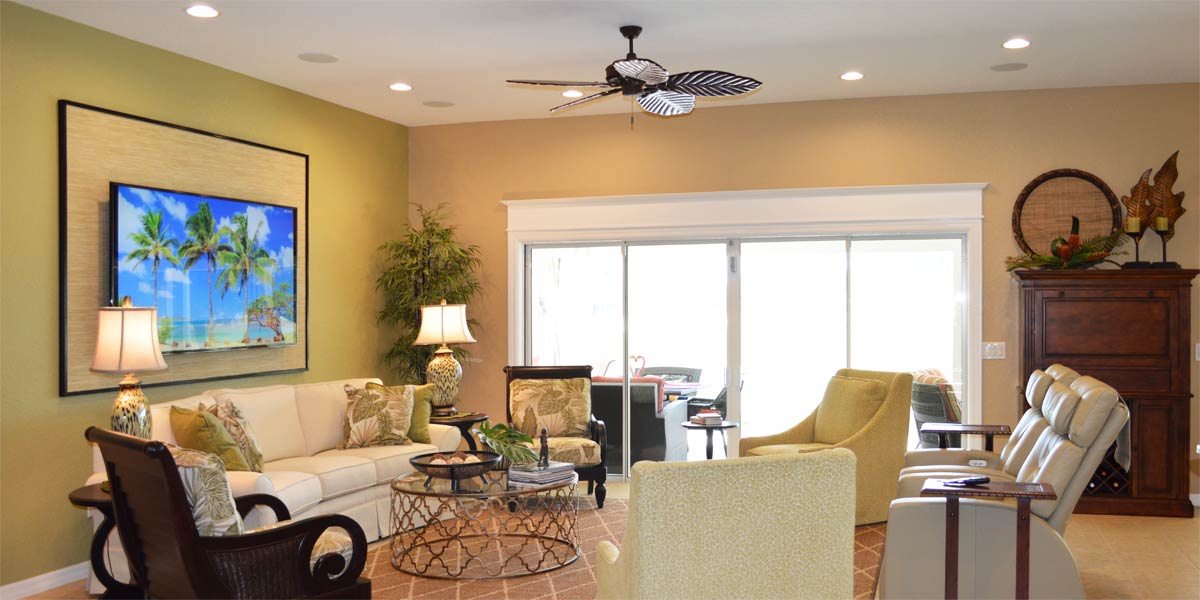
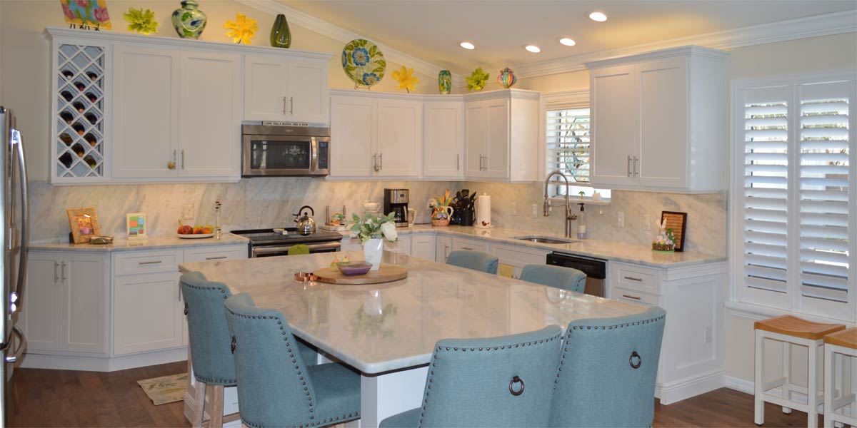
How can white be defined by Webster’s dictionary as: free from color and then described as a color by other sources? I have developed an explanation once all of the information I retrieved from the internet congealed in my mind. White is what our eye interprets when it sees all of the wavelengths of light equally balanced. So then, white is a color that it is the perfect combination of all colors in which the final outcome is free from color. In the world of decorating white is the great balancer because it is perfectly balanced. If a room is dark, add white. If you need a pop of contrast, add white. If you want a classic kitchen, better make it white. For the last two weeks we have observed the transformation of a Gardenia model with Coco Whip walls move from dark to light and bright. This week we will look at the kitchen and kitchenette of the Gardenia to see how white creates balance somewhere in the heart of The Villages.
• White kitchen
The kitchen was already white in this house so that was a plus. The kitchen cabinets were refaced when the owner moved in to the home. Though that looked nice, there was still something lacking, which was visual continuity. We fixed it by adding white.
• White wainscot
Anytime there is an island in front of a kitchen, the island should be treated with wainscot and painted white. The wainscot provides protection from kicking feet and it provides wavelengths of light that are perfectly balanced. This perfect balance works to create visual continuity with a white kitchen by drawing the eye toward and into the kitchen. It also works with a dark kitchen by adding a bright pop of neutral contrast to the space. The white wainscot will lighten a non-white kitchen through the contrast of light to dark. White wainscoting below the counter on any island makes the granite or counter top of the island look better because the wainscot is neutral.
• White wainscot in kitchenette
We needed more white to counter act the Coco Whip to make the kitchen feel complete and finished so we added the wainscot to the eat in kitchen or kitchenette. This treatment can be simple and does not have to be bead board. This treatment mimicked what we did in the dining room by adding chair rail and half round to the wall. The wall is then painted white from the top of the chair rail to the bottom of the baseboard. Once the wainscot is completely white it will blend in with the other wainscot in the house.
• Custom island
The Gardenia kitchen is big and it is big enough for a small island. The homeowners had a small island made for the space and it works great for food prep and extra counter space when needed. The homeowners found a remnant of quartz that coordinated well with the existing quartz for the top of the island.
• Above the cabinets
The Gardenia has a great space above the cabinets to showcase art and we did!
We placed a picture by Gene Rizzo titled, “Chairman of the Board.” This picture has lots of natural tones and we framed it in an off white frame. Many people would decide not to try a picture above the cabinets solely based on the idea that we would need all the whites to match. However, all the whites don’t need to match they just need to coordinate. We added a large rustic white clock to the angled wall above the cabinets and not only is it useful but it looks amazing in the space. Above the pantry we placed a large white basket with a woven grass top. The basket was tall enough and wide enough to fill the space above the pantry so that was all we needed. To further highlight the clock we added two white vases on one side and a very cute white owl on the other side. Once everything was in place above the cabinets all the different white tones worked together for visual unity.
• Black canvas
We hung the black canvas with a white flower from the dining room in the newly revamped eat in kitchen and it looks wonderful. Again, some might be afraid to mix black and white with all the Coco whip and subtle teals, but black is also neutral. Black and white can be used with any combination of colors because they are both neutral in the grand scheme decorating.
P.S. –Attention all club presidents! We give free decorating seminars. It is lots of fun and very informative. Call and schedule your club today. Also, we are on-line check out our web-site at www.ruthdyer.com and you can always e-mail us at ruth@finishingtouchfl.com or Call Ruth your full service decorator at 352-804-2056.
Before and After Pics Below


